Metropia’s Carpool for Taipei’s Daily Commuters
Led project planning and user research for a carpool app designed for daily commuters in Taipei, enabling drivers and riders to find matches more easily while solving the inconvenience and lack of real-time coordination in existing LINE carpool group posts

Result
2 rounds of usability testing with total 9 participants recruited from real LINE and Facebook carpool communities.
80% said they would use it for their next carpool.
83% could complete a match without any help.
Participant feedback:
“If the real app works just like this MVP, it will be a game changer.” - Emma Wang
“I haven't seen anything like it yet. I’d use it if you really launch this app.” - Leo Chen
“If this app can help me find matches faster, I'd happy pay for it.” - Ryan Lin

Deliverable
Spec
User Flow
Prototype
Role
Lead Designer
Context
Q1 2023
Design, PM
Problem Space
Neihu is one of Taipei’s most congested employment districts. Every weekday, tens of thousands of office workers leave at unpredictable times. Taiwan’s workplace culture operates on a “stay until the job is done” basis, and leaving time is rarely fixed. With ongoing MRT construction making public transit even more overwhelmed, carpooling has become one of the most common ways for commuters to get home. But finding someone to share that ride has never been easy.
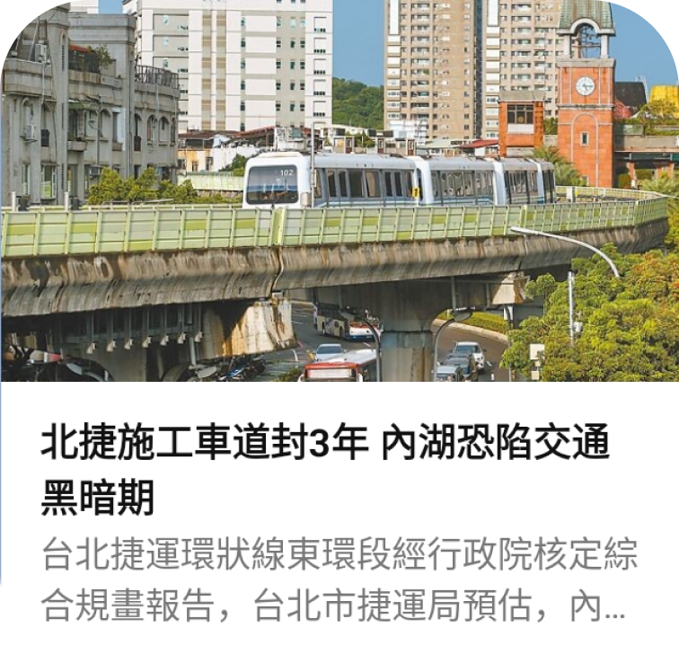
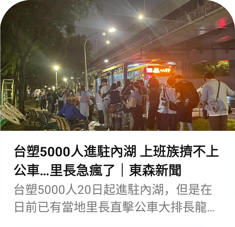
Two headlines from local news outlets capture what commuters in Neihu were dealing with.
Current solutions leave commuters stuck
In Taipei, commuters rely on two ways to find a carpool home.
The first is digital. People join LINE groups to post their route, departure time, and fare — then wait for someone to reply. But LINE is fundamentally a chat room. To find a match, commuters have to manually scroll through a mix of posts and unrelated replies, filtering for origin, destination, and time. And because leaving time is rarely predictable, by the time someone posts or finds a match, the ride is often already gone or no longer available.
The second is physical. At designated spots near Neihu’s office buildings, commuters queue up and ask passing drivers where they’re heading. But the window is extremely tight. Police regularly clear the area when too many cars gather, which means drivers can’t afford to wait. And if they leave without a passenger, coming back means another 15 to 20 minutes of traffic. One missed connection, and the opportunity is gone.
Both approaches share the same core problem: commuters have no efficient, reliable way to find a match. Whether it’s scrolling through a chat room or standing at a street corner, getting home still comes down to timing and luck.
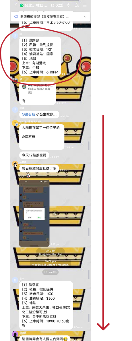
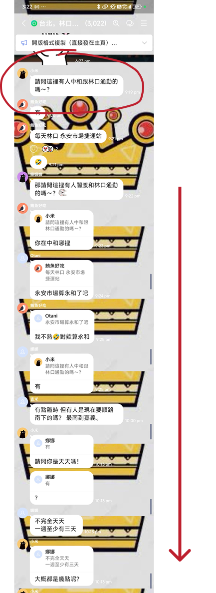
To find a match, commuters scroll through a mix of posts and unrelated replies. There is no way to filter.
Defining what both drivers and riders need
Metropia already had the technical infrastructure for real-time matching. The challenge wasn’t building the system. It was designing an experience that commuters would actually choose over a LINE group or a street corner queue.
I worked with the PM to map out what each role actually needed to accomplish. Four user stories drove every major design decision.
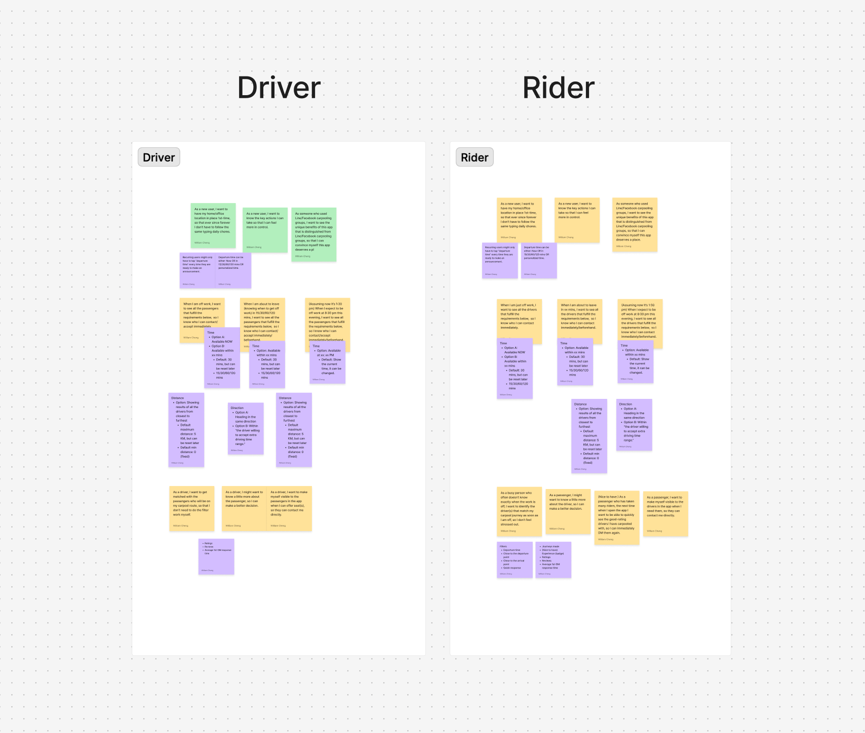
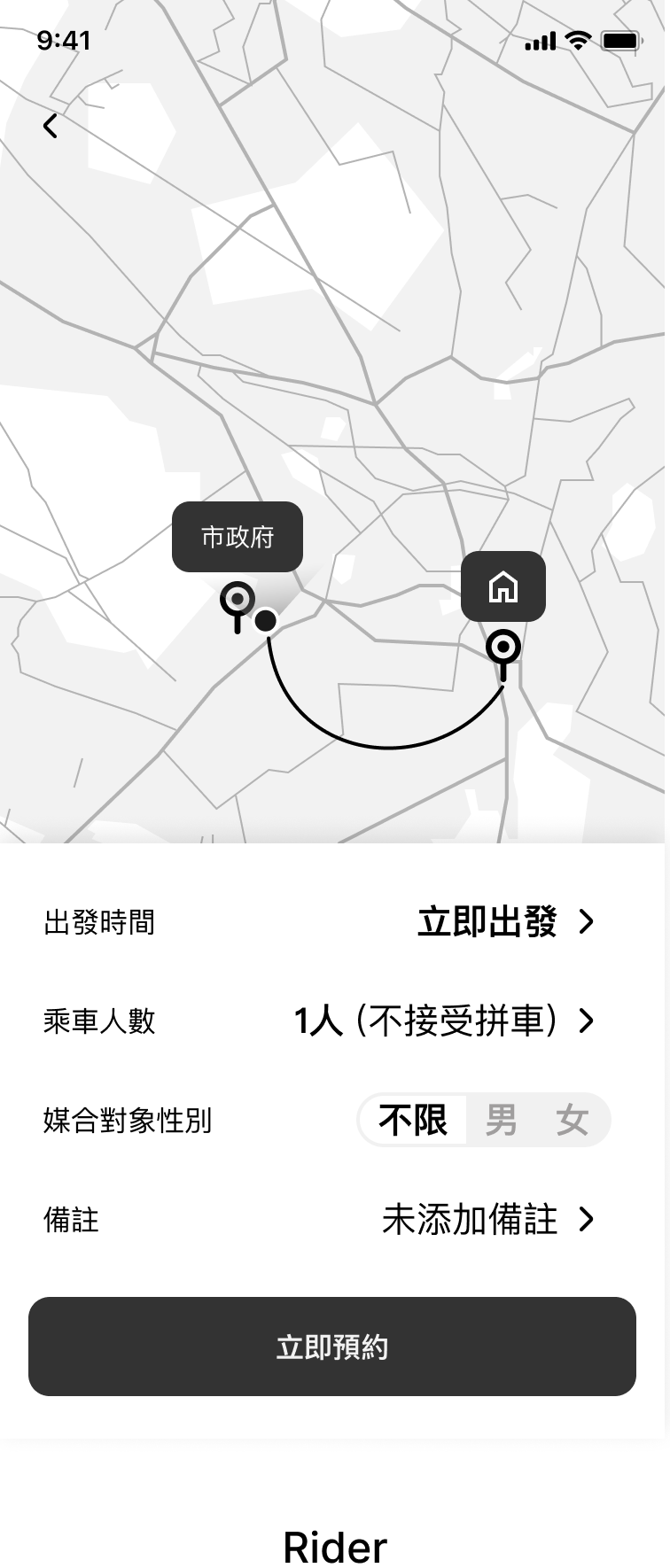
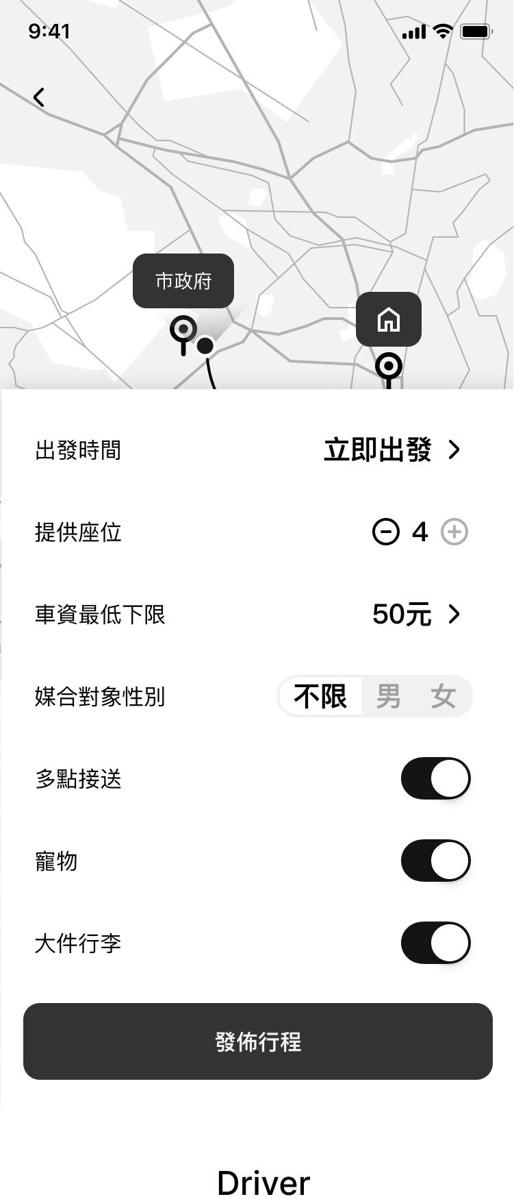
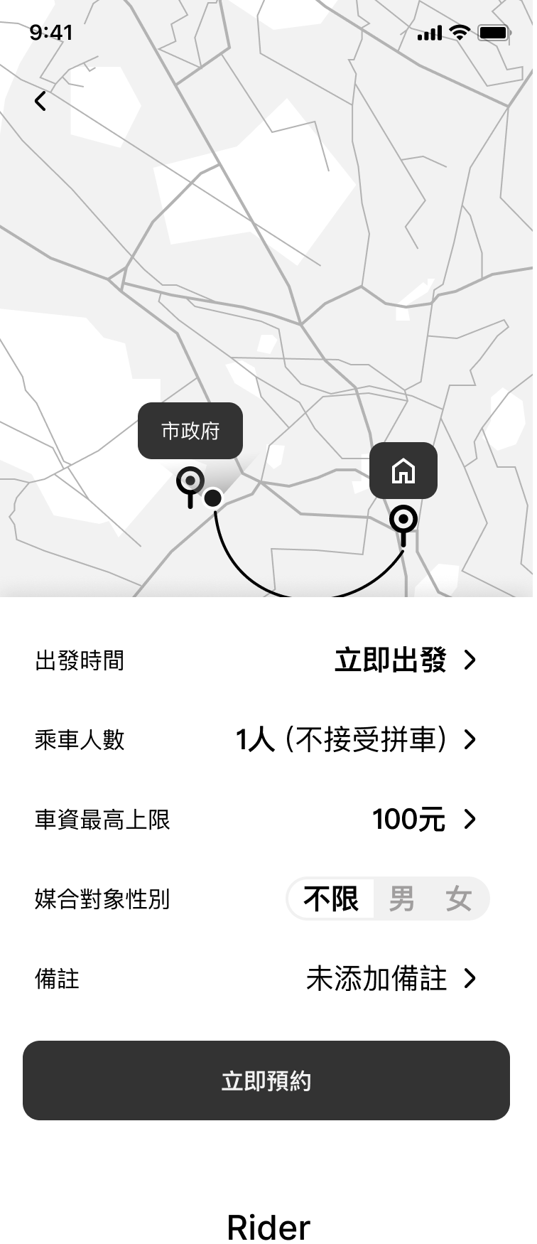
Setting up trip preferences
As a driver / rider, I want to set up my trip preferences so that I only get matched with people who fit my route and conditions, without having to filter through everyone myself.
Finding a match
As a busy person who doesn’t have time to constantly check my phone, I want to see my matches the moment I open the app, so I can act on them right away.
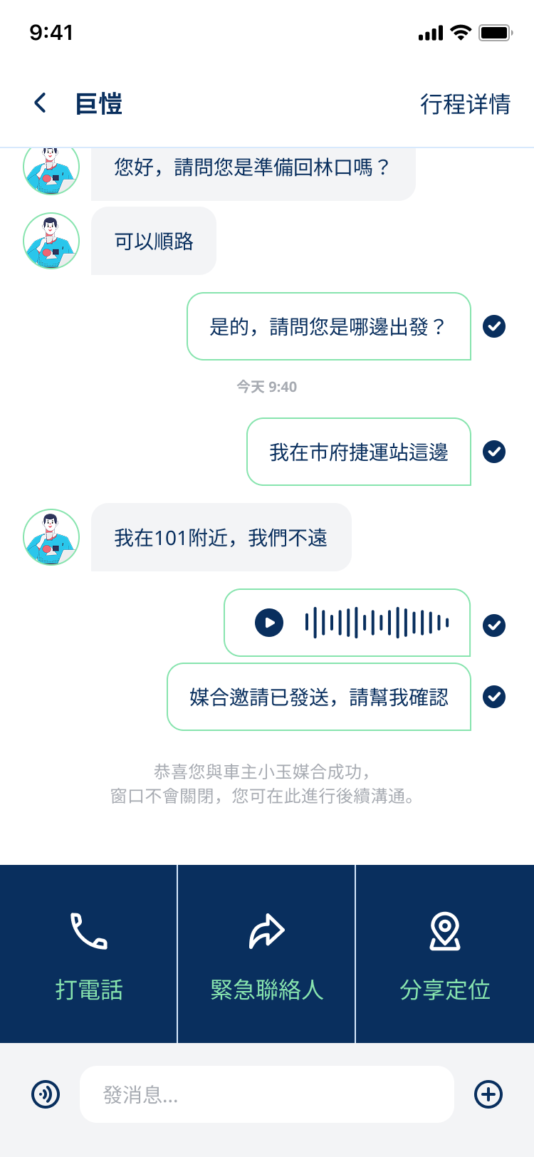
Messaging
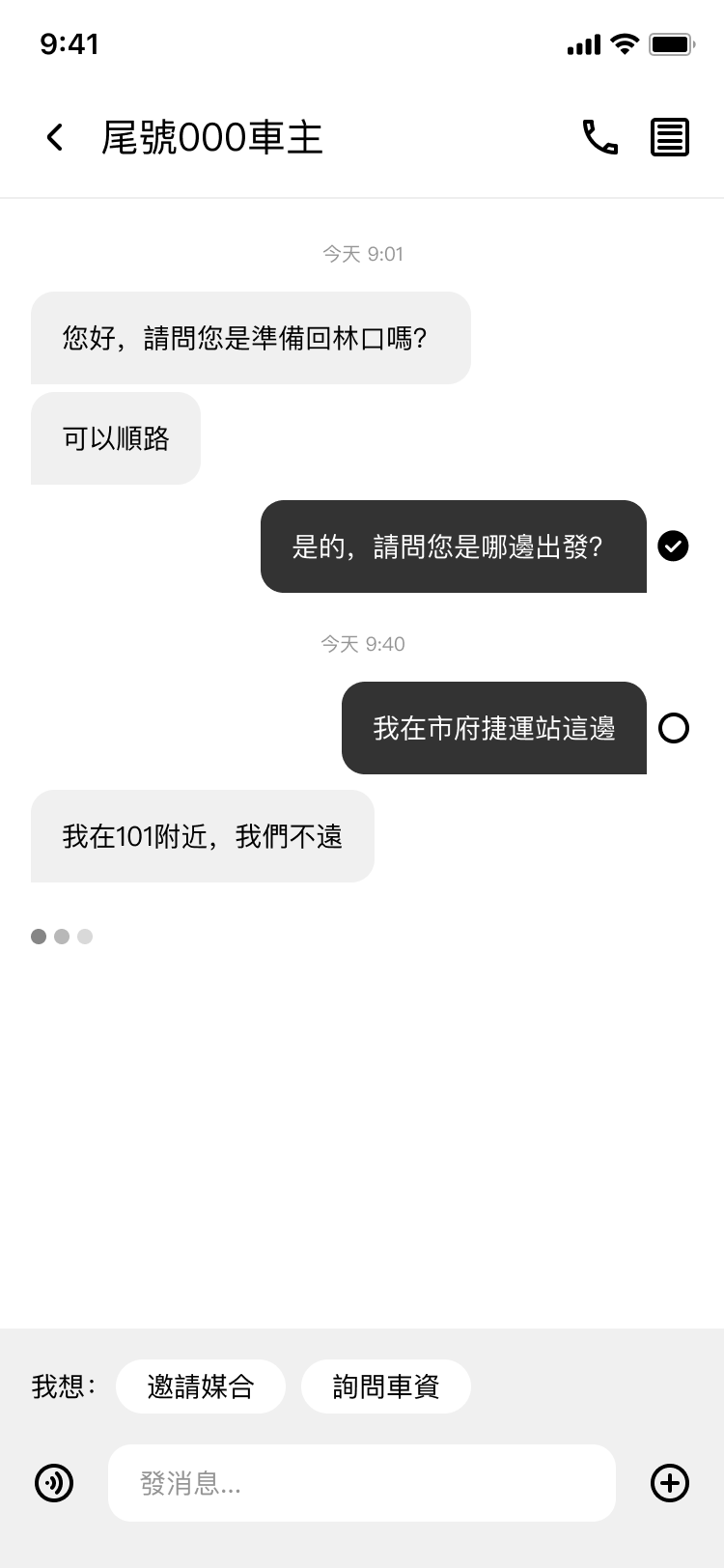
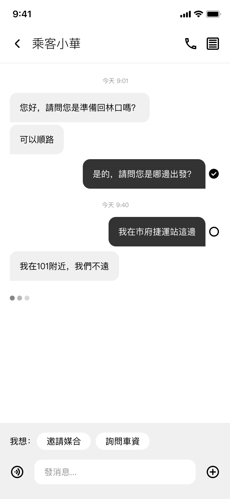
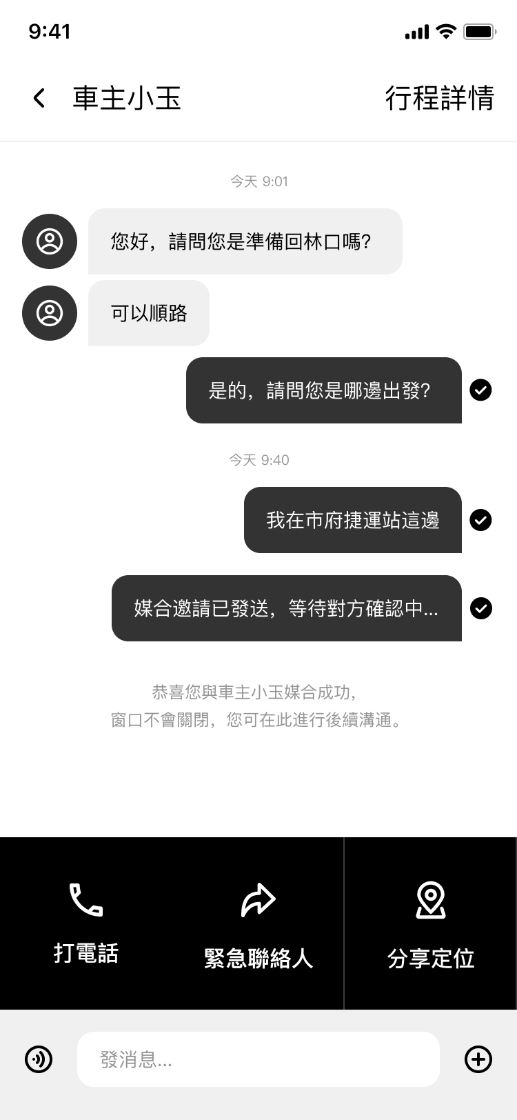
As a driver / rider who has found a potential match, I want to DM multiple people at once so that I can maximize my chances of finding a confirmed ride without waiting on one person at a time.
Scoping the MVP
Based on what both drivers and riders needed, the MVP came into focus quickly. The core hypothesis was simple: both sides want to carpool, but have no efficient way to find each other. If we could solve that, giving both sides a way to find a match without having to do everything manually, everything else would follow.
The MVP focused on the daily Taipei commute, the highest-frequency, highest-friction use case. Intercity carpooling was a deliberate second phase, not an afterthought. The existing Facebook communities showed the demand was real, and the same infrastructure could extend to cover it. But solving the hardest problem first, unpredictable, real-time, high-pressure matching, would prove the core experience before expanding scope.
Ideation
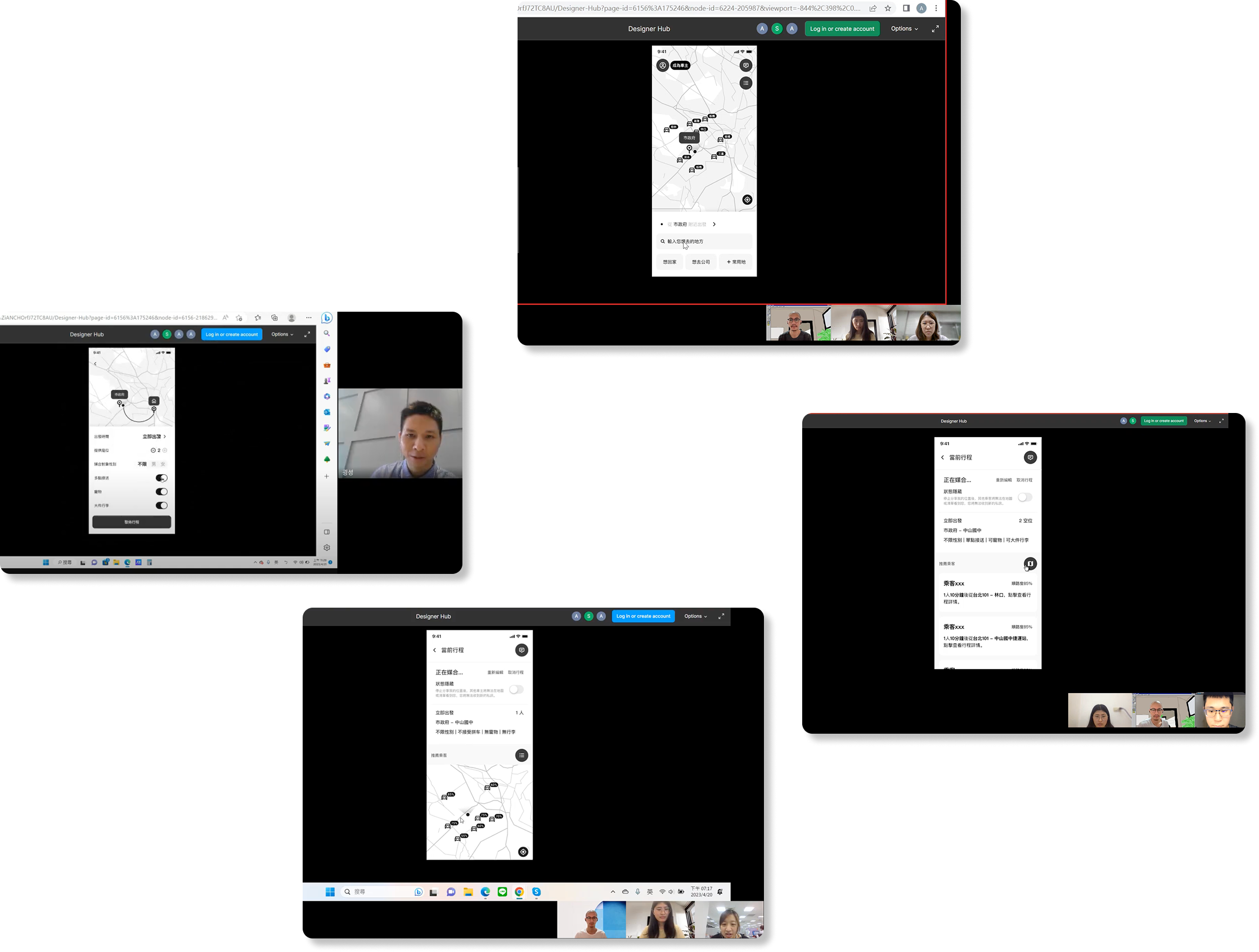
Each of the four user stories had a flow. Here is how they came to life. Working alongside another designer, here is how we brought them to life.
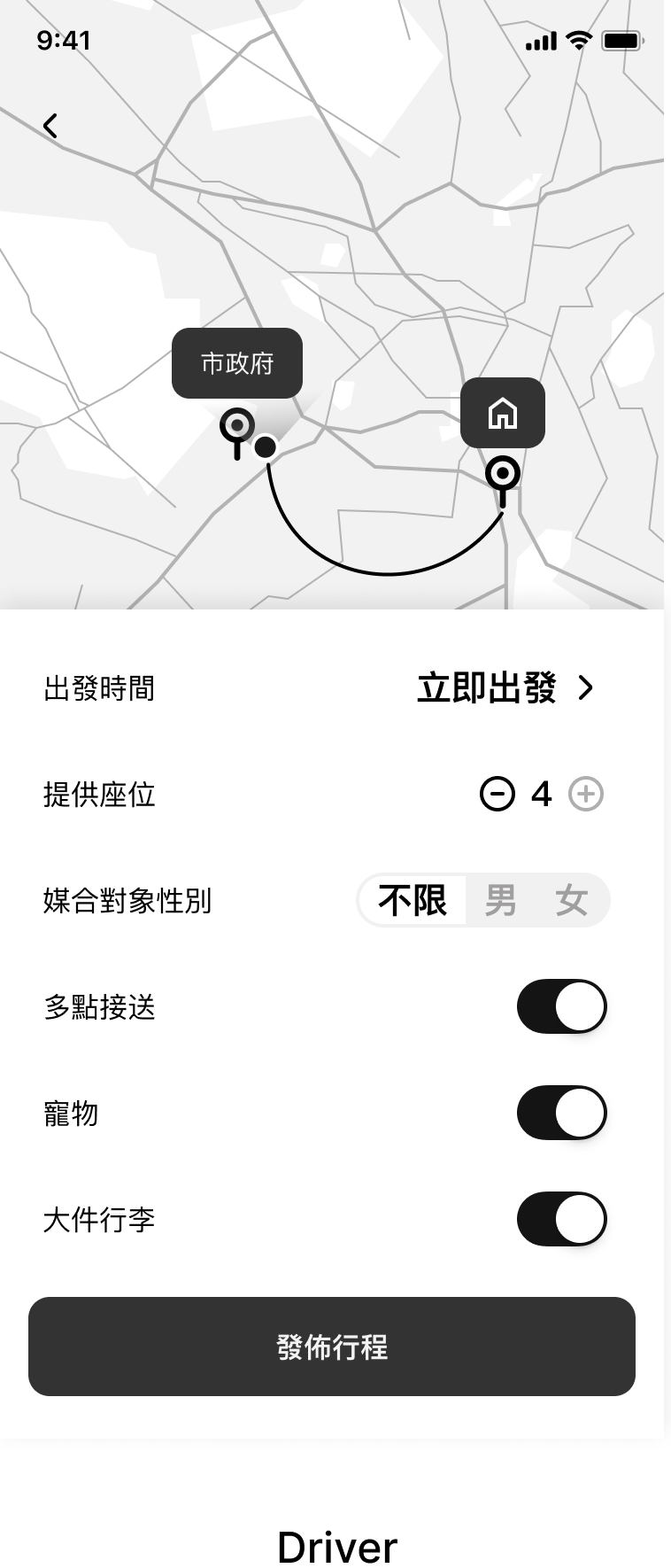
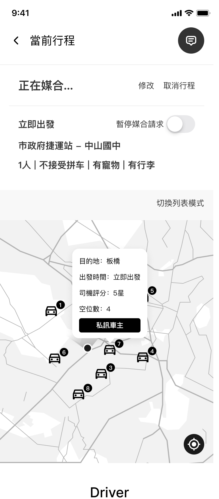
Driver
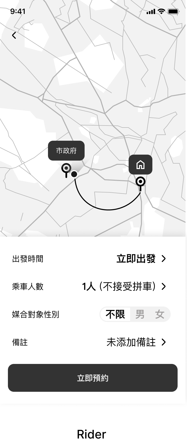
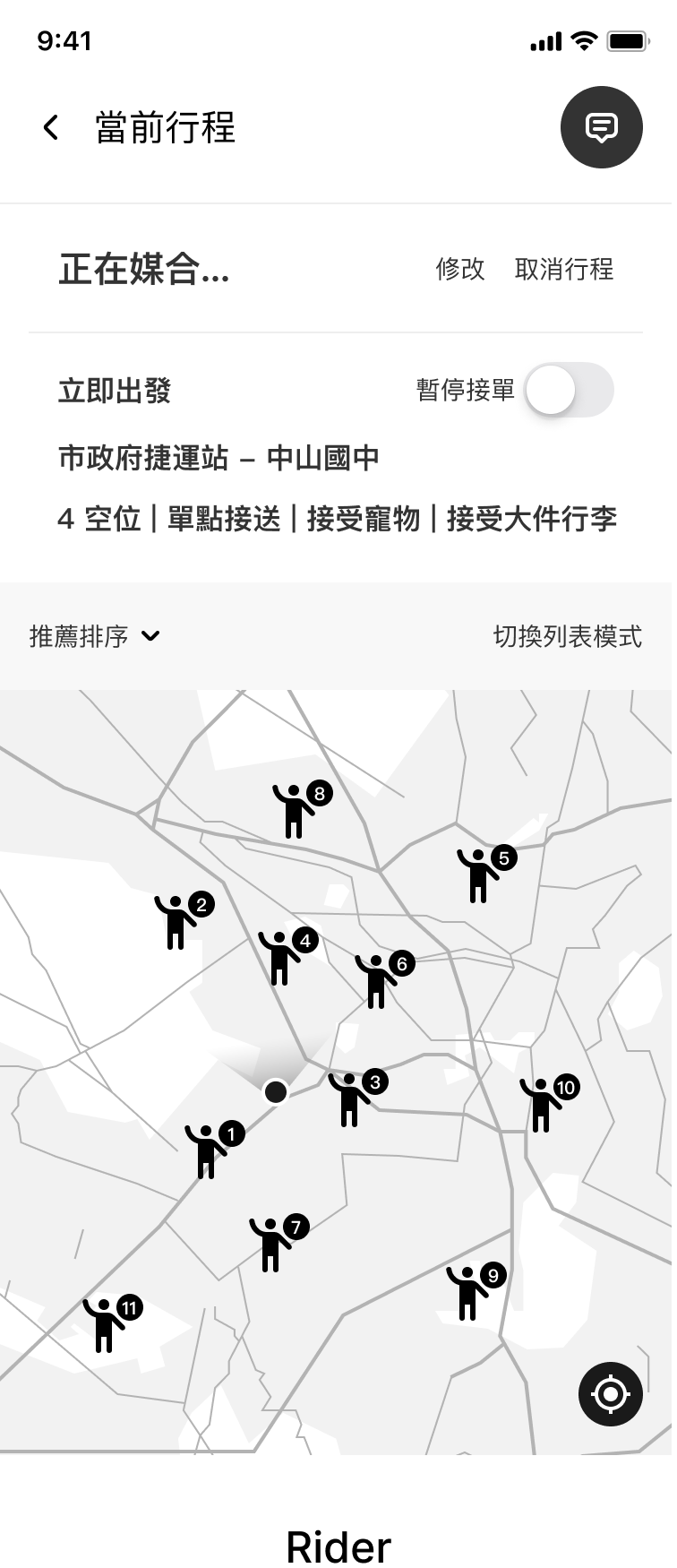
Rider
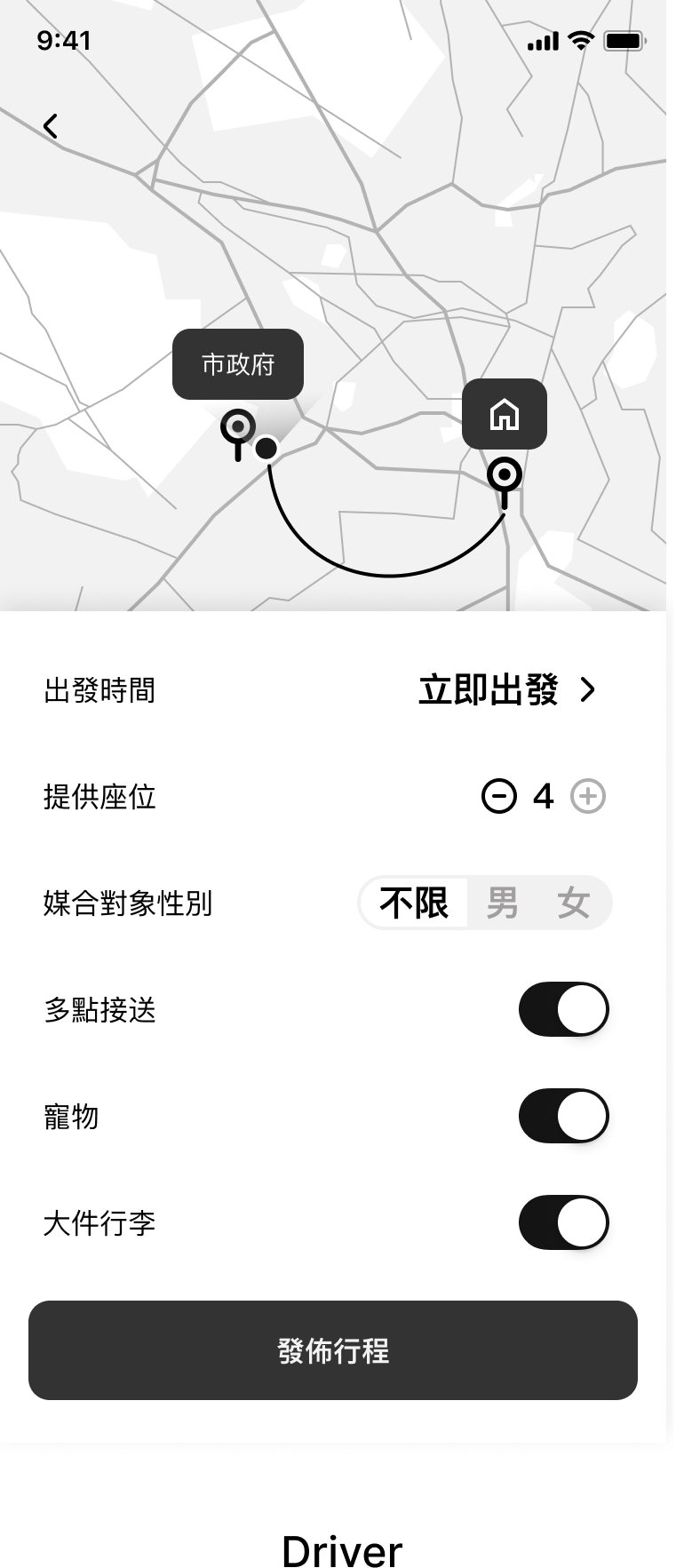
Both sides set their own conditions before posting a carpool trip.
Driver
Rider
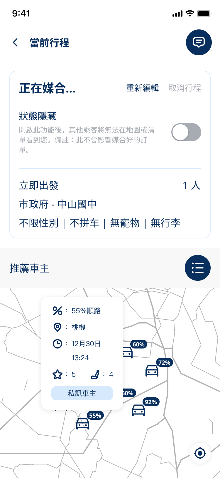
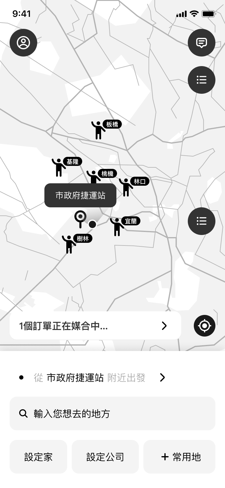
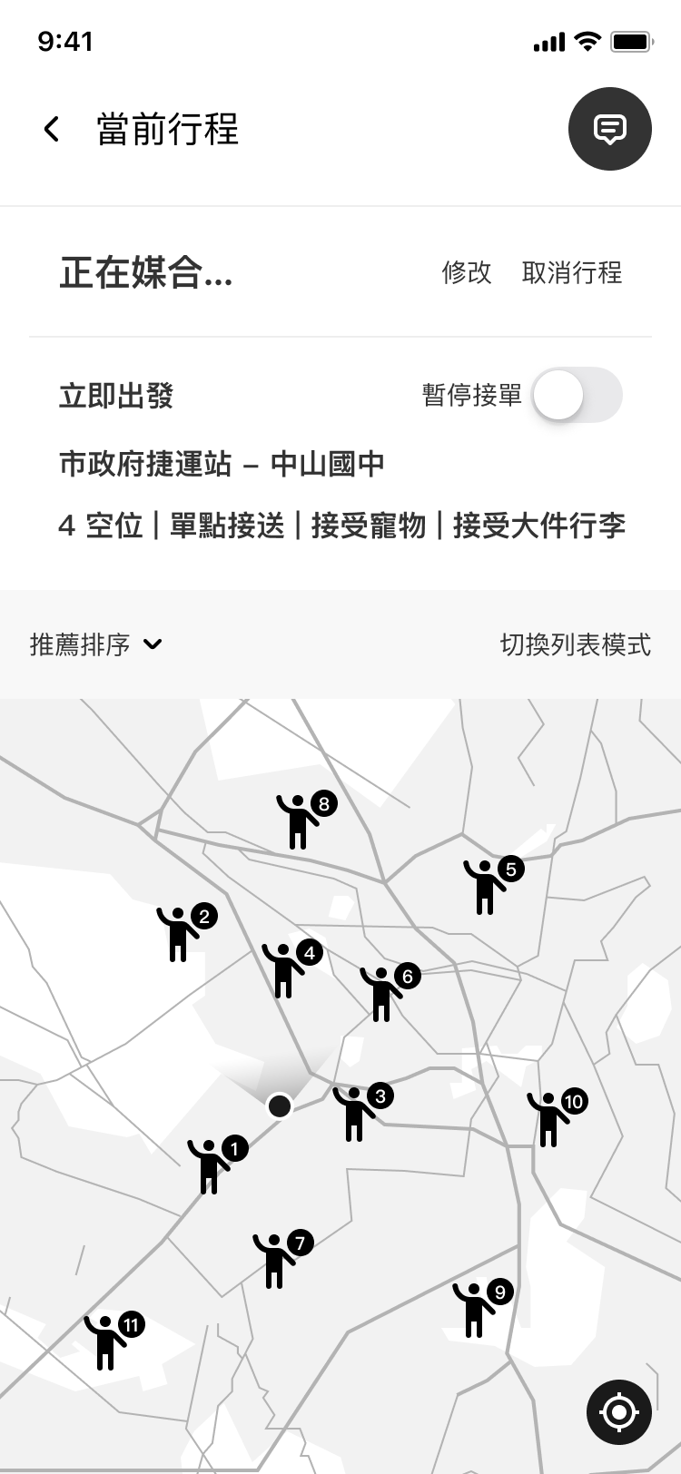
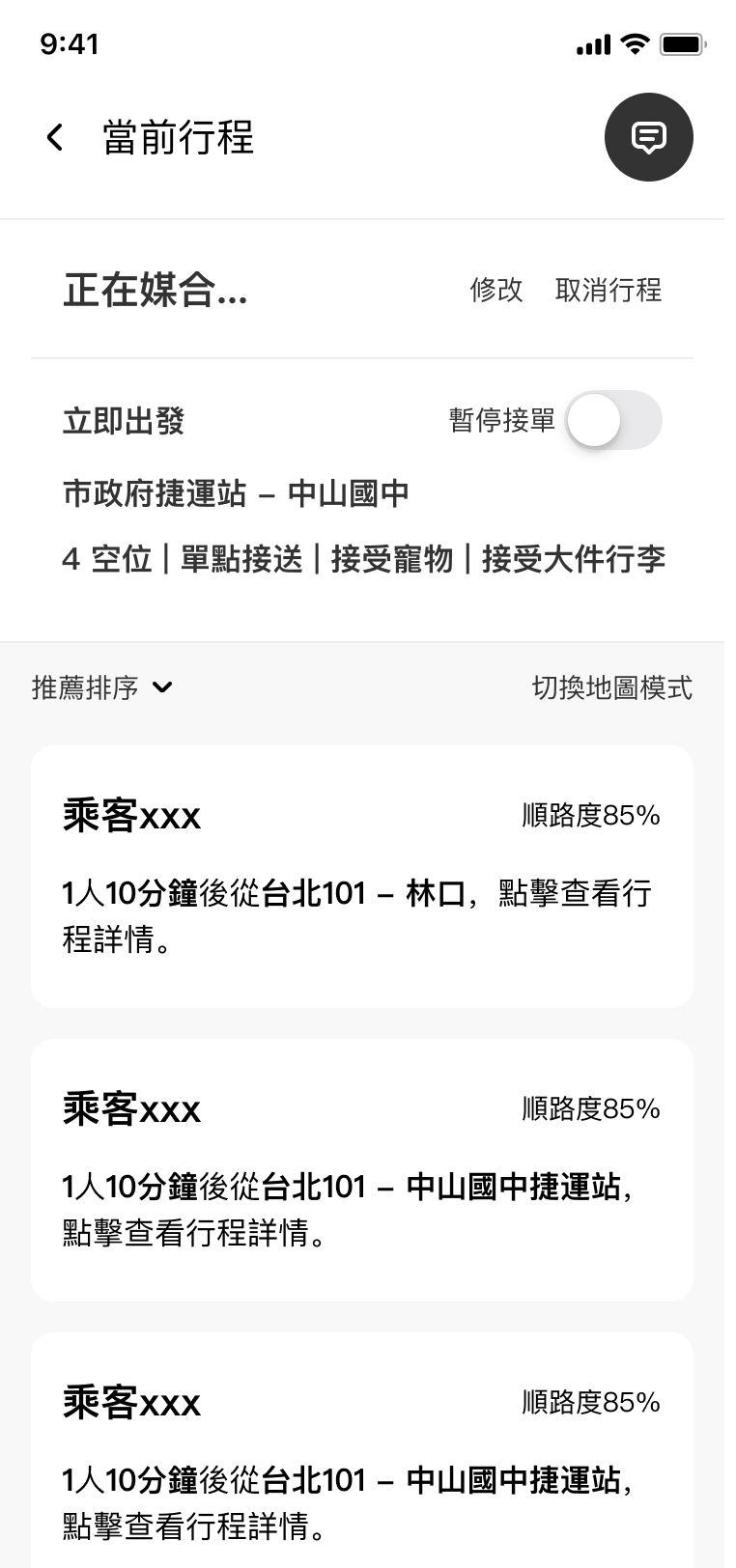
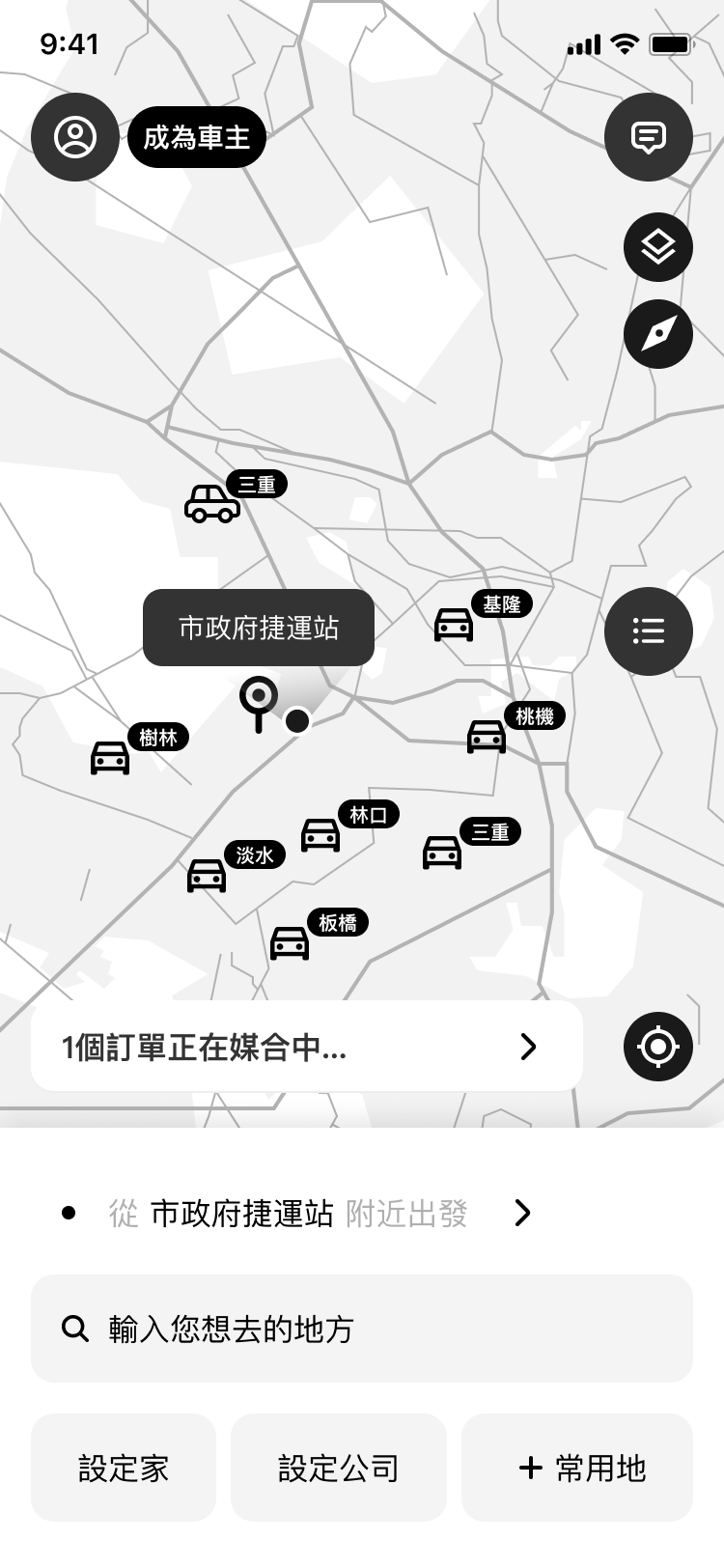
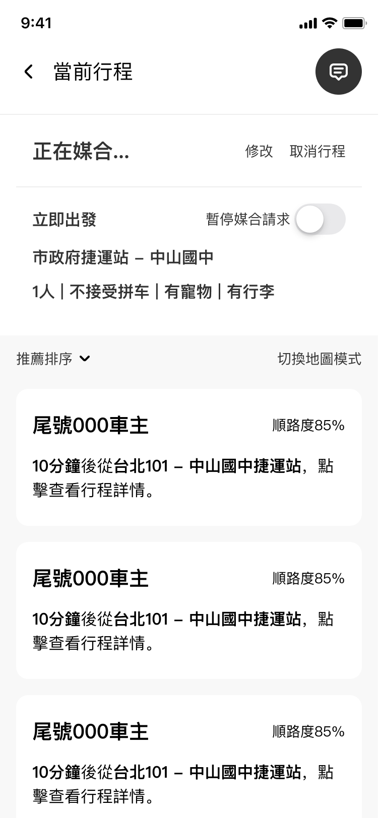
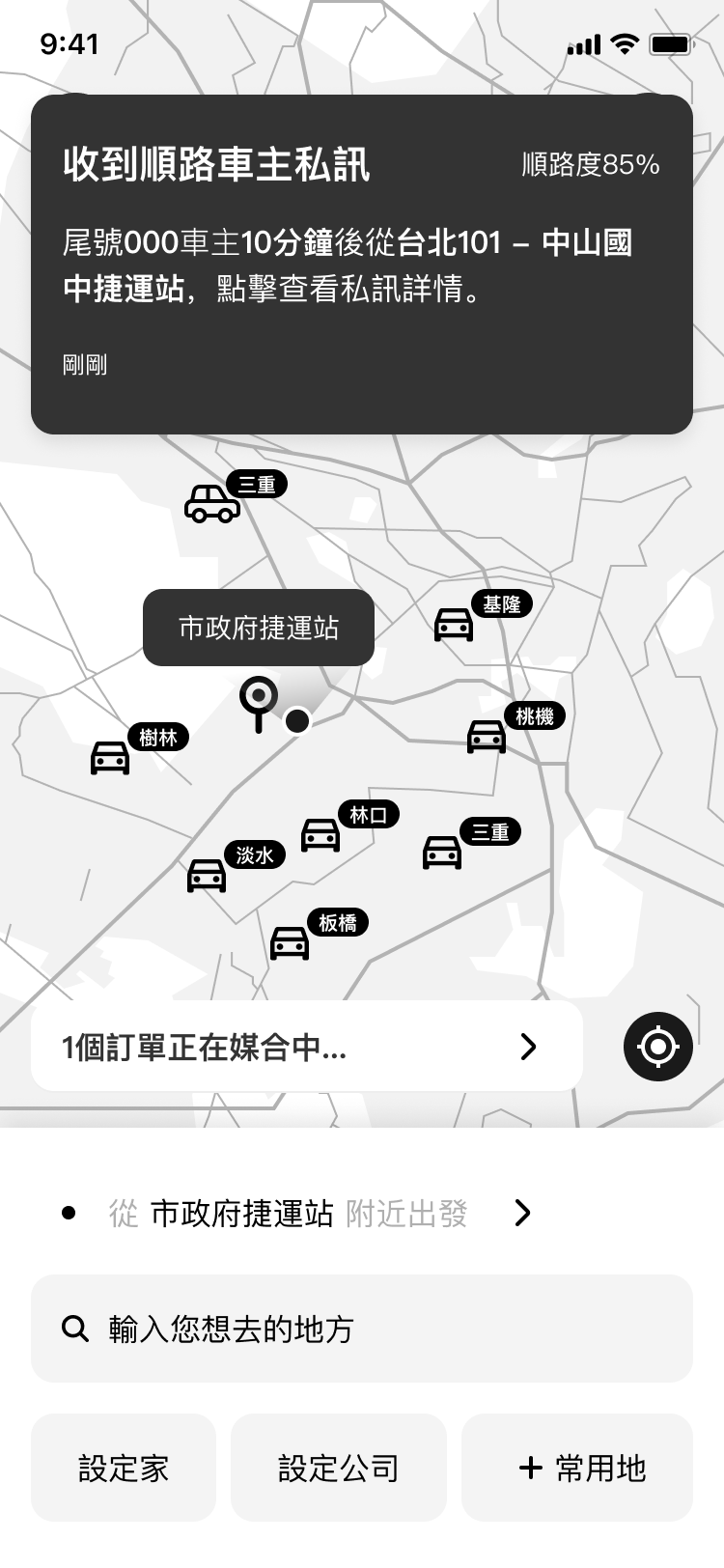
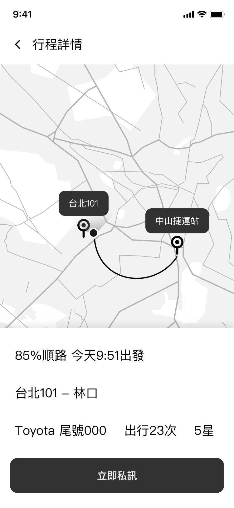
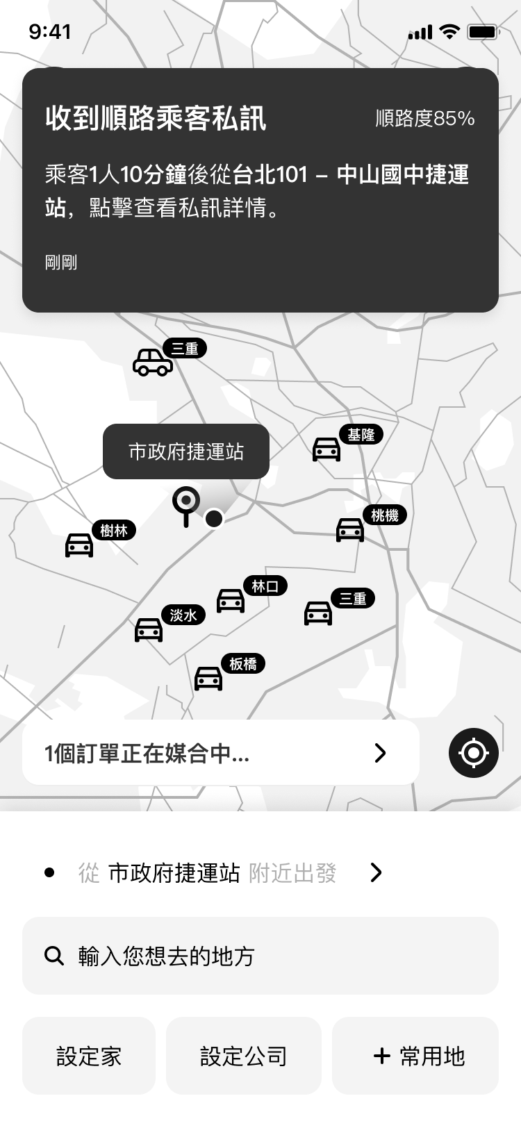
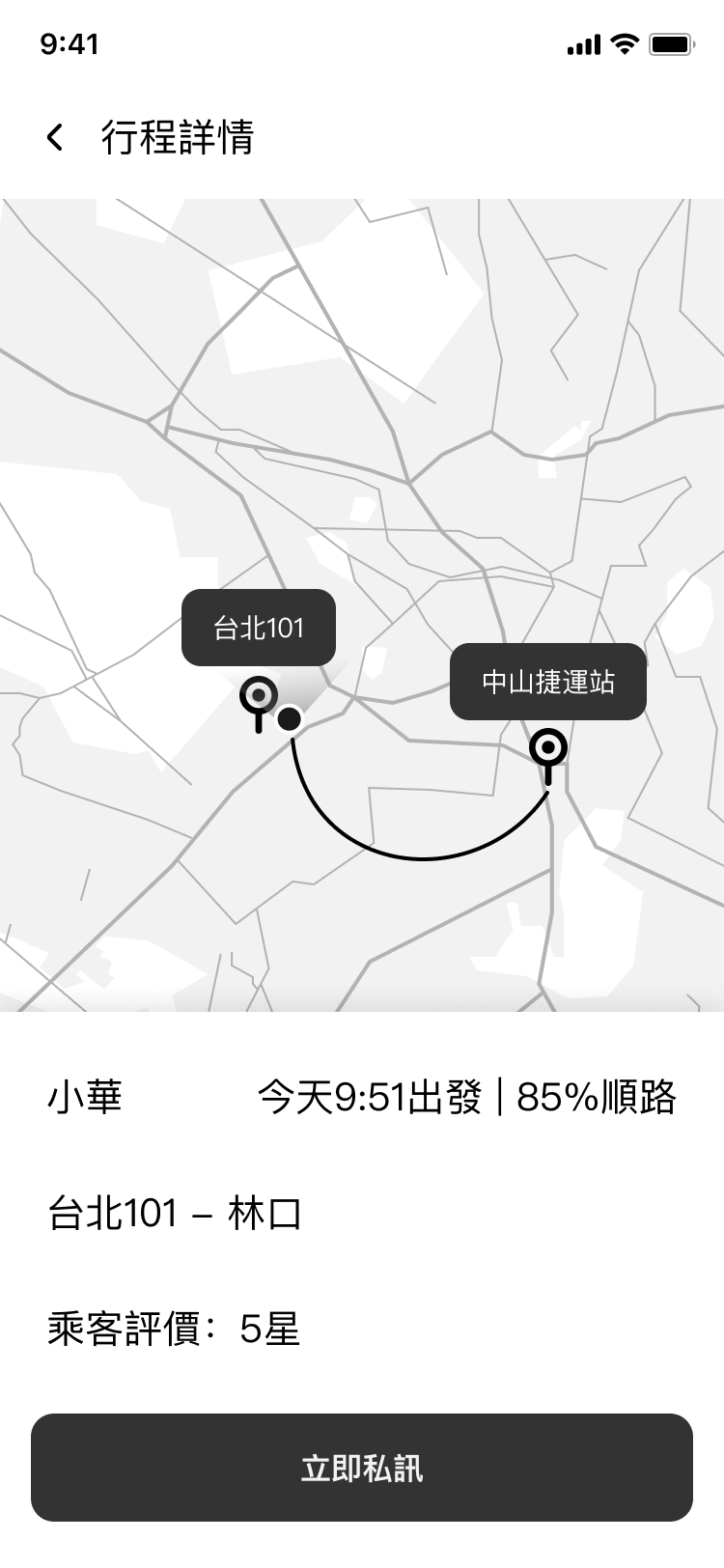
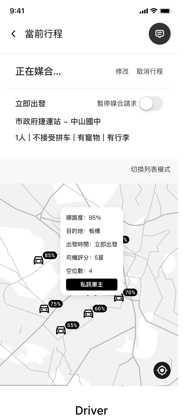
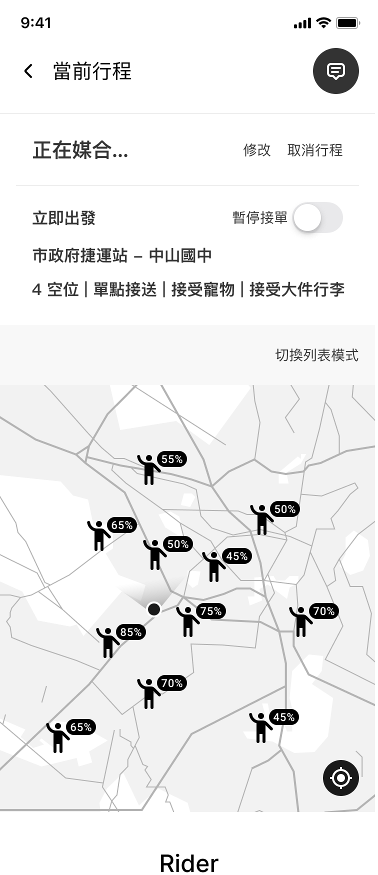
Once posted, matches appear on a map or a list with compatibility scores.
Driver
Rider
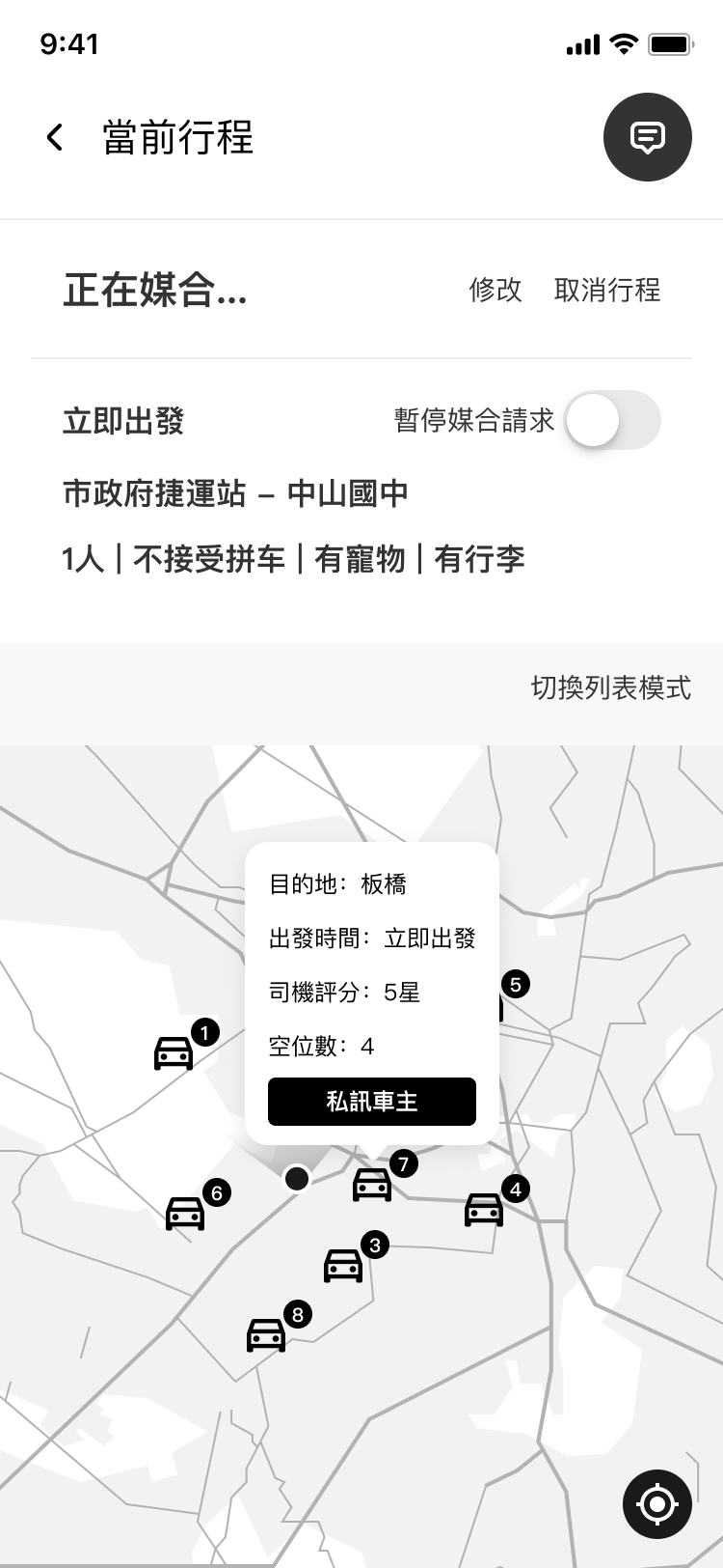
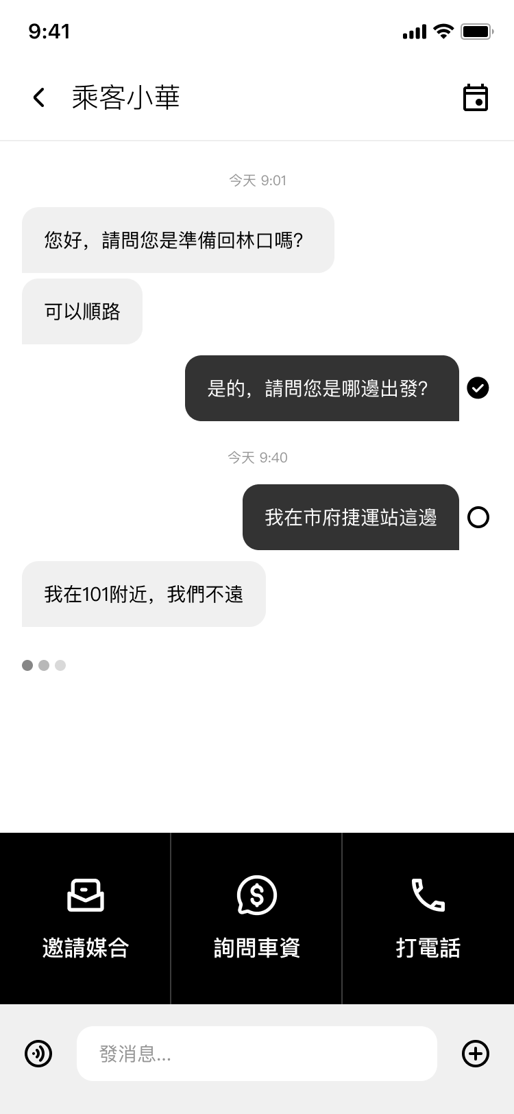
Both sides can check each other's route and profile.
Putting it in front of real users
We recruited participants directly from existing LINE and Facebook carpool communities, people already living the problem we were trying to solve. Because leaving time in Taiwan is rarely predictable, we tested two scenarios with each participant: one where they needed to leave right now, and one where they knew in advance when they’d be done.
The overall direction landed. 2 issues pointed to something deeper.
Before
After
I used a number to rank matches, with 1 as the best option. Nobody understood what it meant. We replaced it with a route compatibility score, which immediately communicated what users were actually looking at.
Before
After
Nobody knew where to tap to view the other person's route detail. The icon didn't communicate what it was. We replaced it with a clearer icon and moved the call action to the bottom row.
We tested again
We fixed what Round 1 surfaced and tested again. Two more findings came up.
Before
After
Both sides didn't want to negotiate fare one-on-one. We added a fare range selector so both sides could set expectations upfront.

Before
After
Both sides found "End trip" and "Trip recording" confusing the moment their match was confirmed. "Trip recording" was added for safety, but nobody understood what it meant. "End trip" was the bigger issue: tracking whether a trip ended was never part of what this app was built to do. We removed both and replaced them with emergency contact and share location.

The project didn't move to development. An external partnership that would have taken it to market didn't materialize. But two rounds of testing gave us something real — a design that held up under actual user scrutiny, and a clear picture of what comes next.


