Elevating iMarts’ Home Experience for Travellers
Redesigned the iMarts home screen, a travel e-commerce platform connecting travellers with local restaurants and shops, enabling users to quickly understand the app’s value and easily discover relevant local tips and recommendations

Result
The marketing team ran 7 tests showing that the new concept layout increased users’ understanding of the app’s value by 30%, with participant feedback informing the final design decisions.

Deliverable
Spec
Prototype
Role
Lead Designer
Context
Q1 2021
Design, Marketing, Data, FE
Problem Space
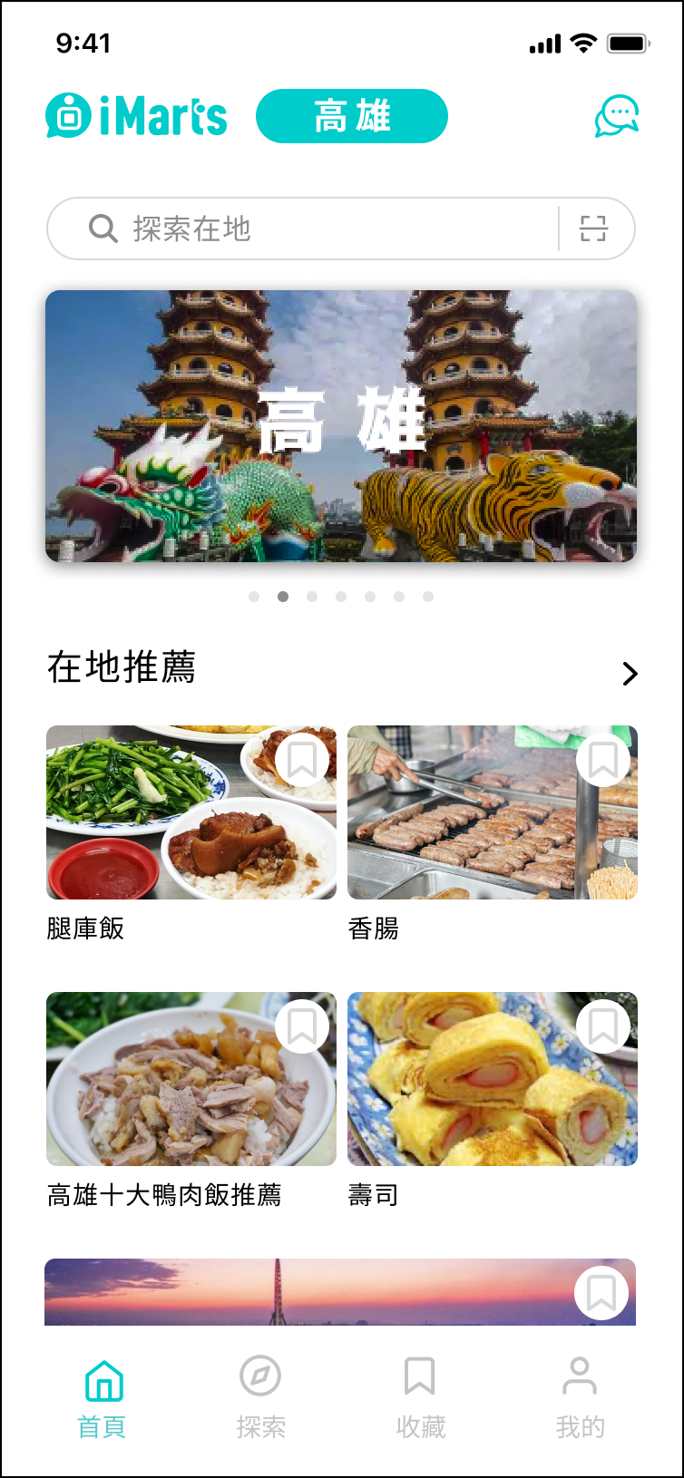
iMarts is a travel e-commerce platform that connects travellers with authentic local restaurants, shops, and activities.
But the home screen didn’t reflect that. Over time, features were added as the product grew: social follows, loyalty points, campaign banners, friend recommendations, merchant listings. Each one reasonable on its own, but without a consistent view of what a traveller actually needs at that entry point. The result was a screen that tried to do everything at once, and in doing so, failed to communicate what iMarts was actually about.
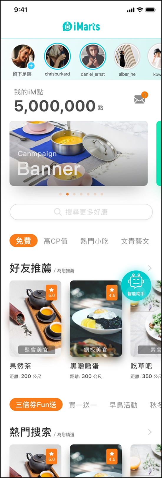
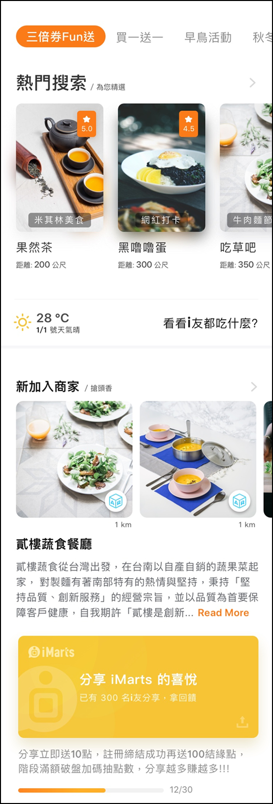
The home screen at the time. The left shows what users see on arrival, the right shows what they encounter as they scroll. Features kept getting added, each reasonable on its own, but with no consistent view of what a traveller actually needs
Project Goals
I worked with the CTO to get clarity on where the product was heading. That conversation gave me a clear foundation.
On the business side, the goals were to
- Create brand differentiation
- Lead users to make more purchases.
On the user side, travellers needed two things
- Travel tips from local sources
- Personal recommendations they could trust.
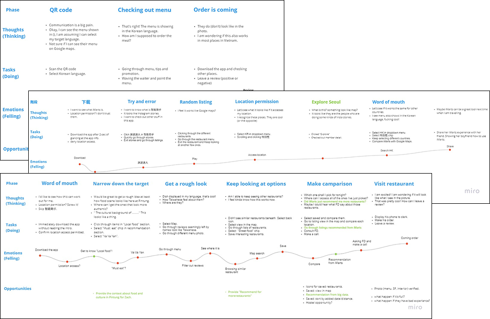
Defining User JourneyTo understand what travellers needed from the home screen, we mapped three scenarios based on different download entry points, each representing a different mindset at the moment someone first opens the app.
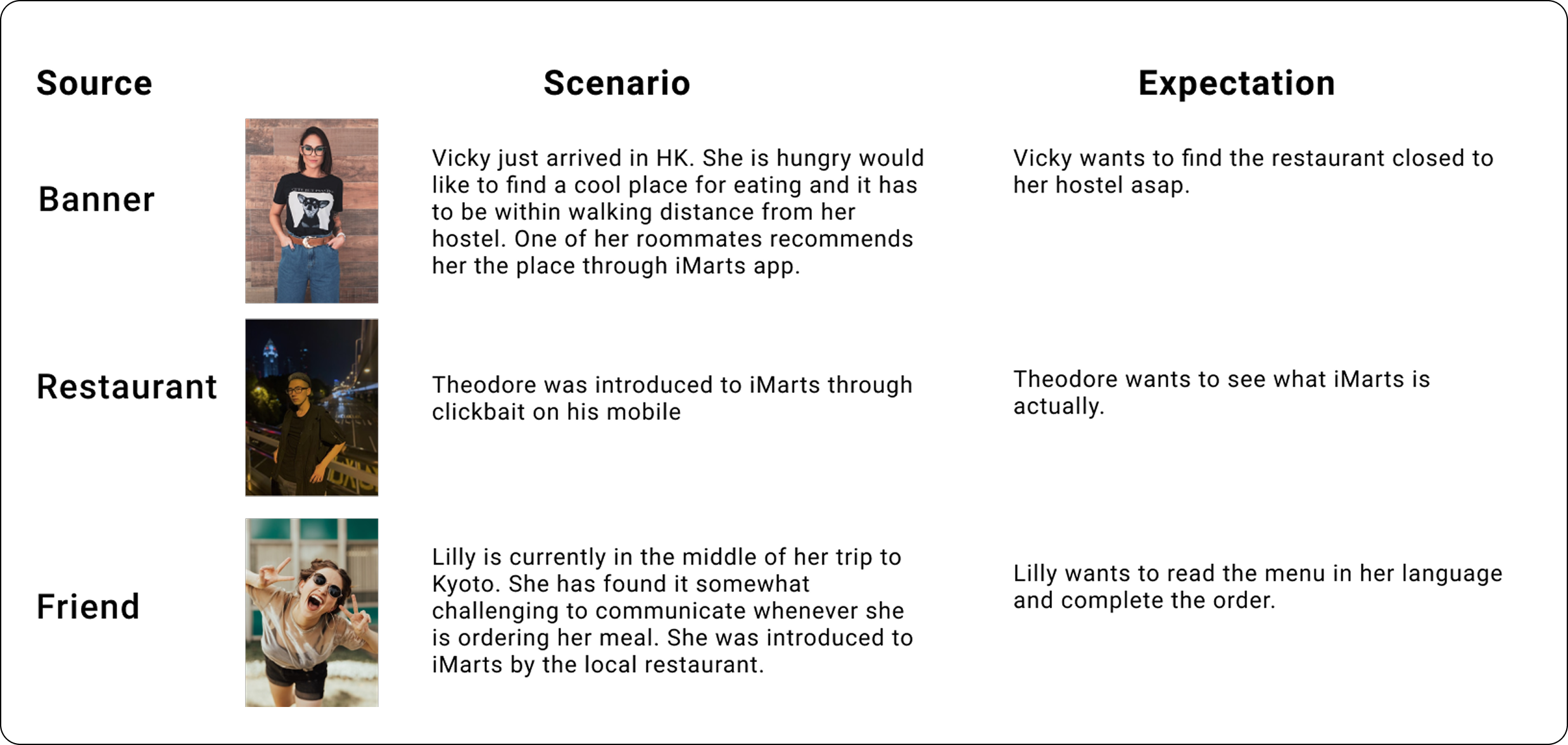
Building the journey map had a different starting point. Part of the foundation came from my own experience. 14 months travelling across SEA and Europe gave me firsthand exposure to how travellers think and behave when they arrive somewhere new. Combined with team brainstorming, we had enough to form a starting point. We treated these journeys as hypotheses, not conclusions, always ready to update them based on what testing would tell us.
What the home screen needed
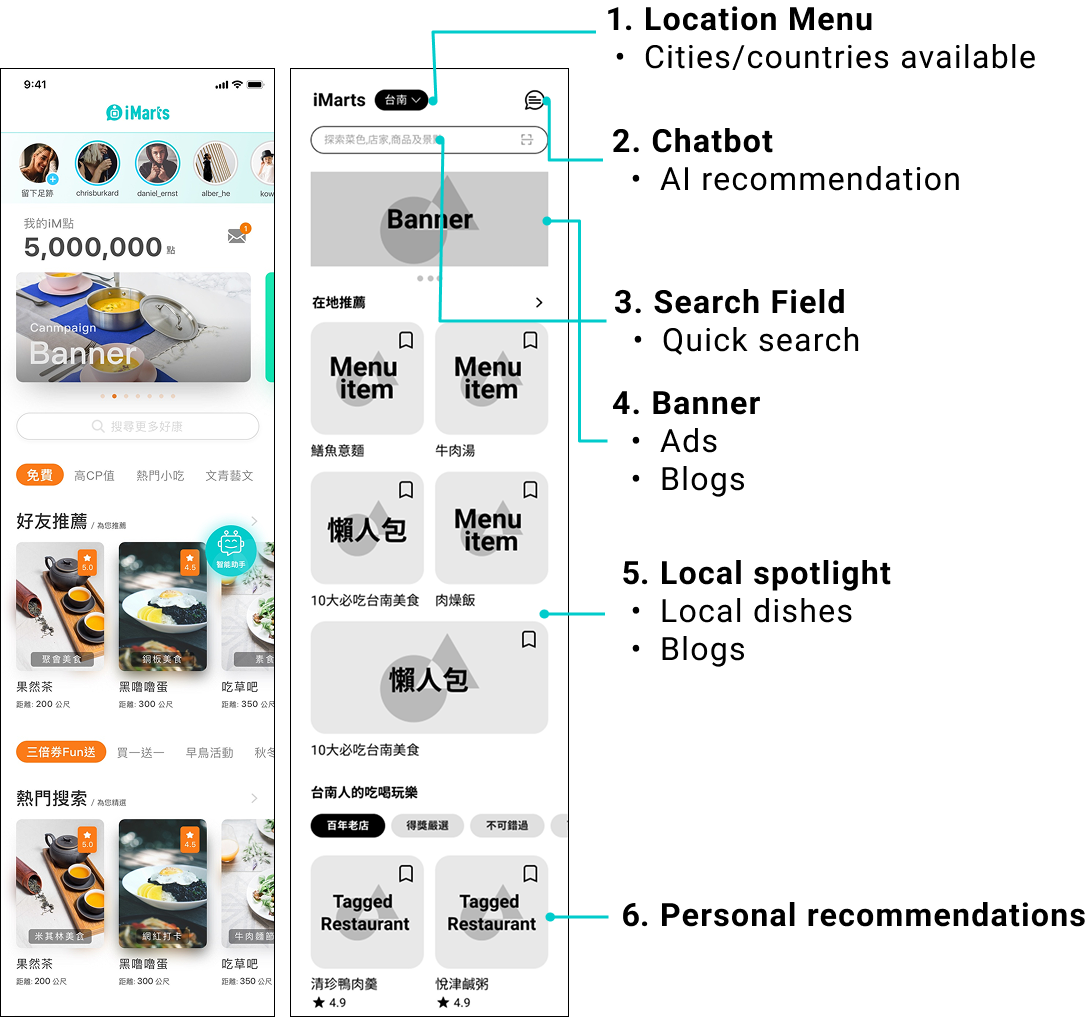
Based on the business goals and user journey, I led a series of discussions with the team to identify what the home screen actually needed to do. Six elements emerged from those conversations, each one tied directly to either a business goal or a user need.
- Local spotlight: Sets the stage at the top of the screen, giving travellers a sense of their destination before they start exploring.
- Personal recommendations: Surfaces suggestions based on each traveller’s preferences and past activity in the app.
- Location menu: Lets travellers set and switch their destination so the rest of the screen stays relevant to where they actually are.
- Chatbot: Helps travellers decide where to go by surfacing recommendations without requiring them to search manually.
- Search field: Lets travellers quickly find restaurants, shops, and places, or scan a QR code to access a menu on the spot.
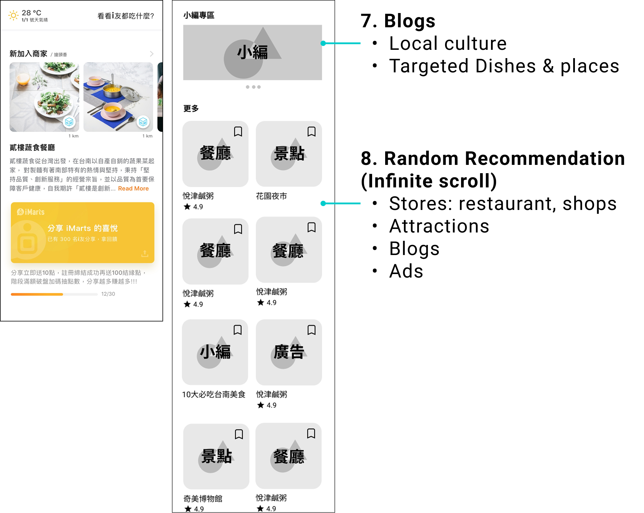
- Blogs: Short, digestible introductions to local dishes and the restaurants that serve them.
Design Exploration
The redesign reorganised the screen around a clear hierarchy. The top leads with local spotlight and blogs, giving travellers a sense of where they are before anything else. The middle surfaces personal recommendations based on each traveller’s behaviour in the app. The bottom is designed for open-ended exploration, an infinite scroll of random recommendations that lets travellers browse without any goal in mind.
Testing
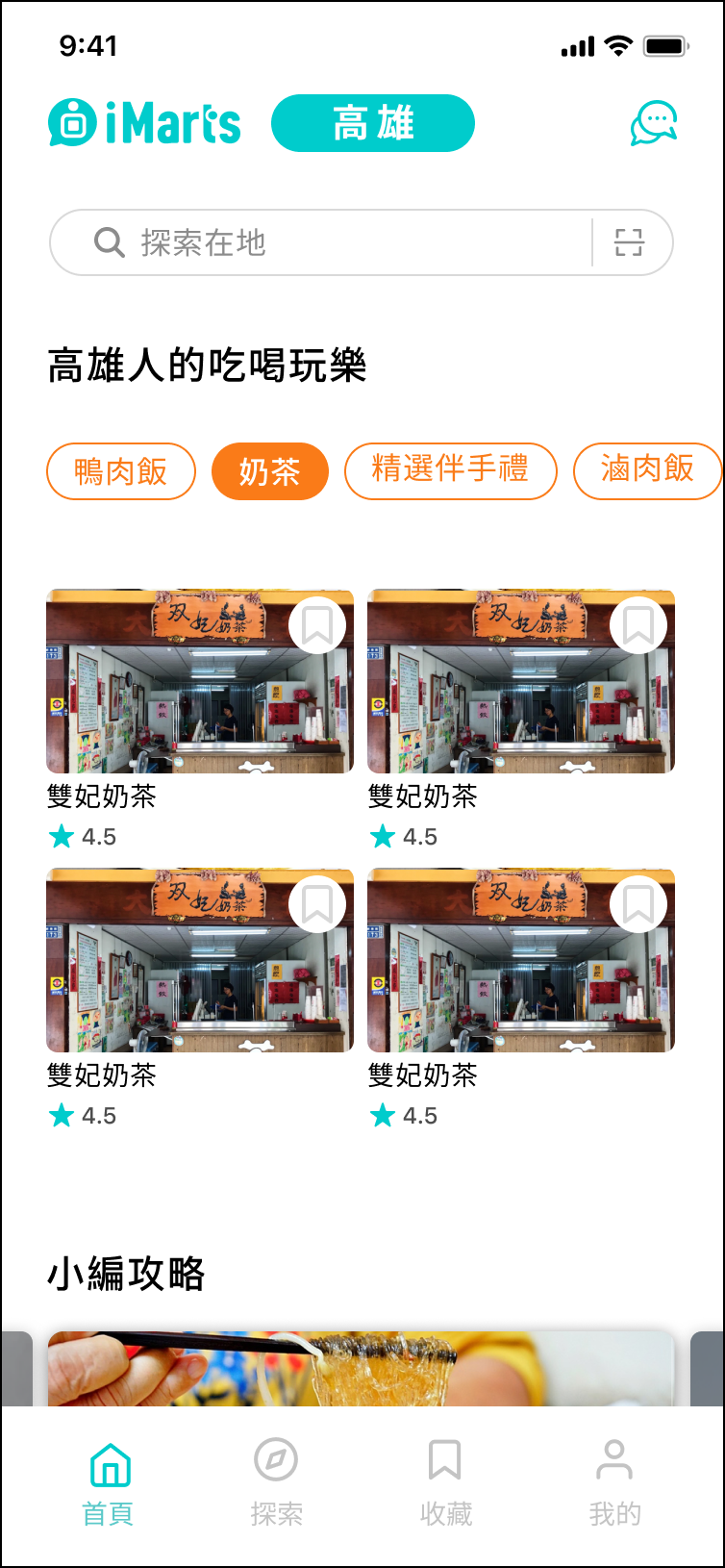
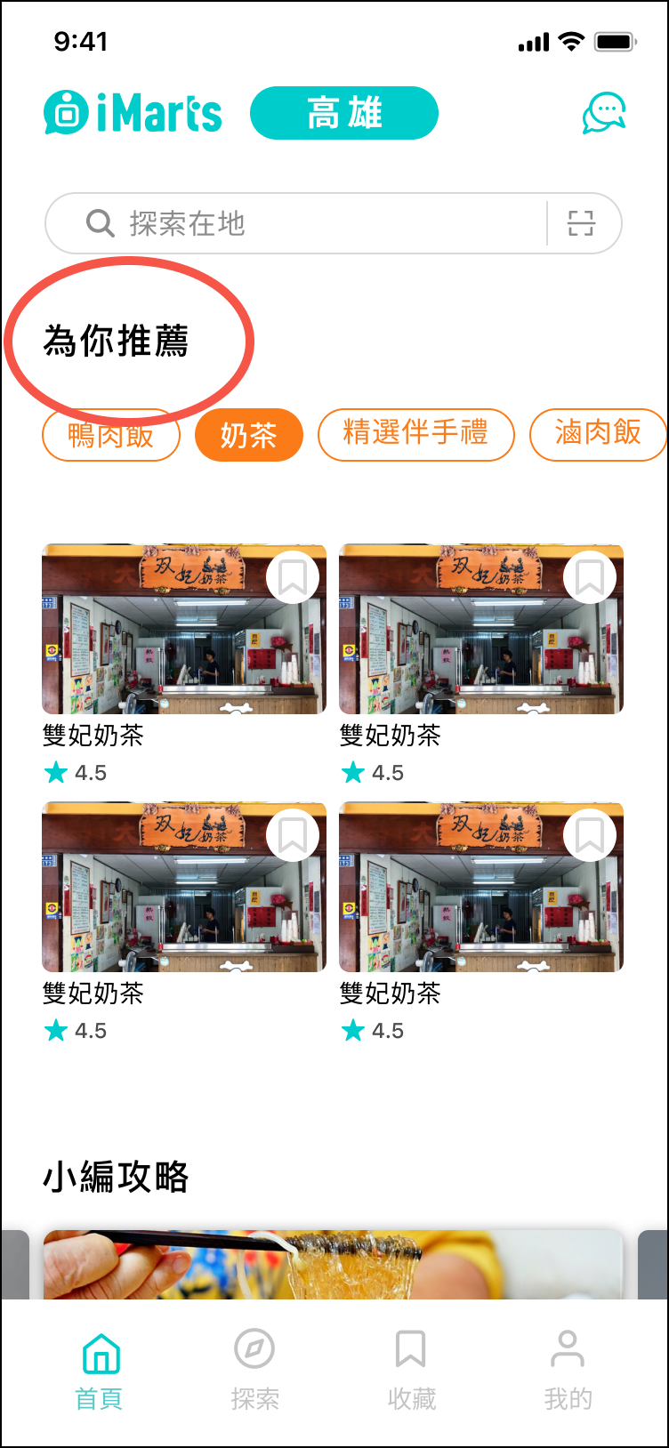
The markering team ran usability testing with real participants. Two findings came out of it
Before
After
Nobody understood that the section was showing their personal recommendations. The label gave no indication of what it was for. We renamed it to make the purpose immediately clear.
Before
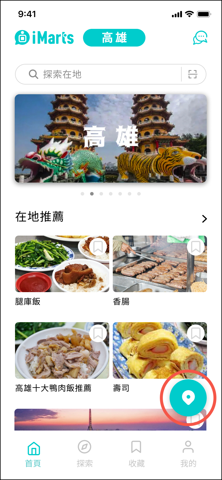
After
Users couldn't figure out how to switch location. The city name in the nav bar wasn't obviously tappable. We added a floating location button.
Reflections
Before touching any designs, I spent a significant part of this project working closely with leadership to understand the business model and product goals. It reinforced something I now carry into every project. Understanding the business is not a preliminary step. It is the foundation everything else is built on.
This project also reinforced something I already knew but hadn’t fully acted on. The people you test with shape the problems you find. Testing within a familiar network limits the range of issues you can uncover. Since this project, recruiting participants outside of existing social circles has become a non-negotiable part of how I approach usability testing.
More projects

Let’s make your app better
Let’s talk
William design
Work

