Psy2gether
Problem
Young working professionals pursuing online education in psychology find it difficult to meet other like-minded students to exchange insights and resources, making it challenging to enhance their knowledge, skills and ability to deepen understanding around topics.
Role
Solo UI designer
Timeline
Aug - Oct 2020 (10 weeks)
Responsibilities
User Flow
Mobile-First Design
Emotional Design
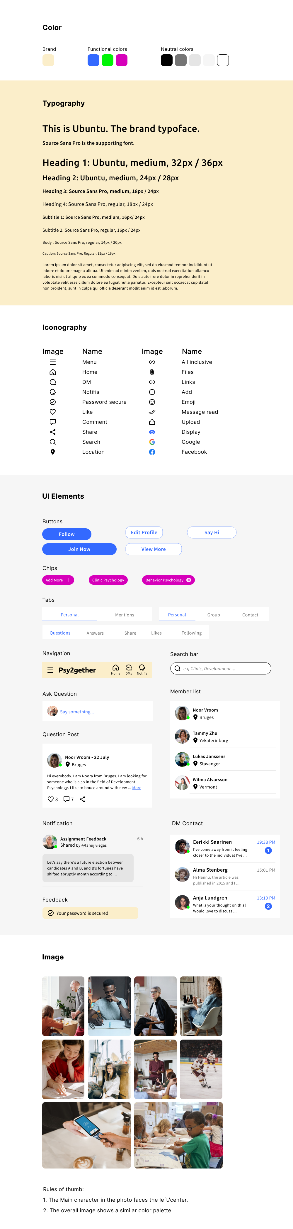
Typography
Color Palette
Mood Board
Imagery
Icon Design
Usability Testing
Interaction Design
Visual Design Direction

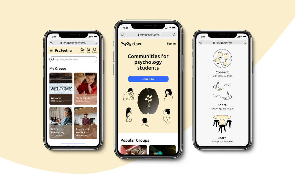
The Project
Online learning can be extremely isolated. The project sought to develop a responsive website for young busy working professionals that would consist of networking groups for major psychology disciplines. Additionally, It would provide a question-and-answer function to facilitate peer learning.
Goals
The goals of this project were to create an inherent user interface to increase student engagement, be perceived as a positive, intellectual online psychology networking website with a playful visual brand.
Process
Coming into this project, user research had been done previously by the client. I picked up the research, continued the project with the entire UI design process and produced the final product. Finally, I conducted usability testing to validate the presented solution to the initial hypothesis.

Target Audience
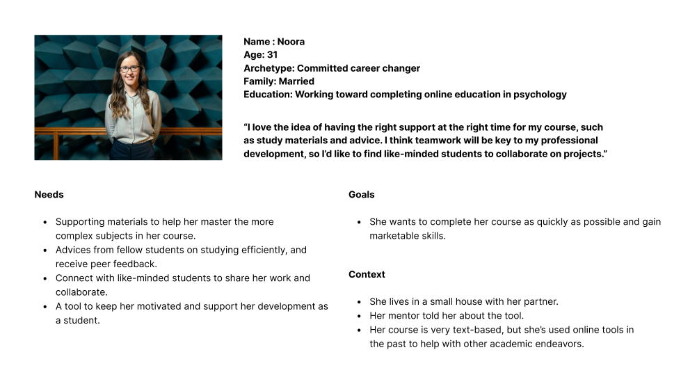
I began defining the target user by translating user research, which includes design context, user’s needs and goals.
The target audience was focused on young working professionals who are juggling work, family and online education in psychology. They would like to connect with other like-minded students in their studying discipline.
User Story

Ideate
What was the design approach to Psy2gether?
The hypothesis was that student wants to connect, share, and discuss assignment on any device anywhere they go so they don’t miss out anything. Additionally, the client also requested a responsive web design. I therefore used mobile-first approach to map out fundamental user needs for mobile screens and followed by bigger screens.
User Flow
To create intuitive user flow, I looked into all of the considerations gathered from the project brief, user persona and user stories.

Prototype
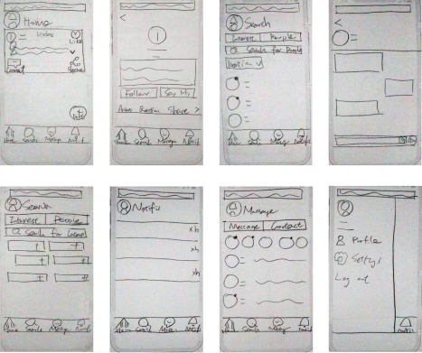
Paper Sketches
I then used pen and paper to generate a sense of clarity on the following tasks:
• Find the right students to connect with and validate those individuals.
• Write questions and get answers in the target groups.
• Layout each profile.
• Interact with each of the posts from other students.
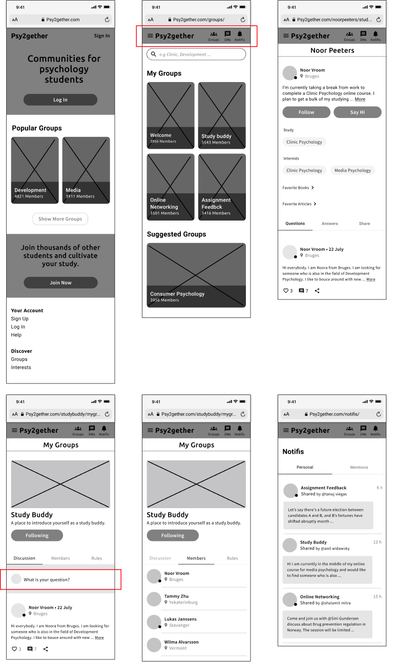
Mid-Fidelity Wireframes
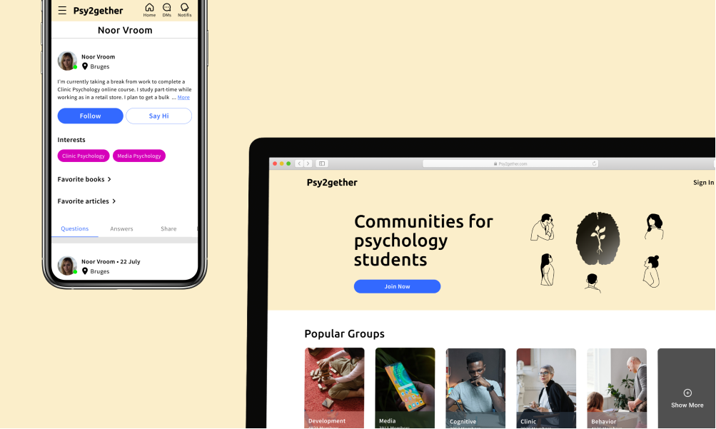
During the process of building the mid-fidelity prototype, I kept thinking about why Noora wants to use our website, I figured that the initial design didn’t solve the problem. The new user interface was built around Groups, a medium that can easily guide Noora to her target group, which helps her to have better interaction with other students and find specific materials she wants.
I explored a variety of group card designs, the focus was mainly on discovering the relationship between varying content, card container and the ADD icon, occurring in 2 different contexts: before/after sign up. To create a consistent visual balance, I found it works best if eliminating the ADD icon.
After finding that both bottom navigation and FAB are not common patterns in web responsive design, I then moved navigation to the top of every screen. For FAB, the purpose was to help Noora to write her questions, I decided to move it under the Discussion tab.
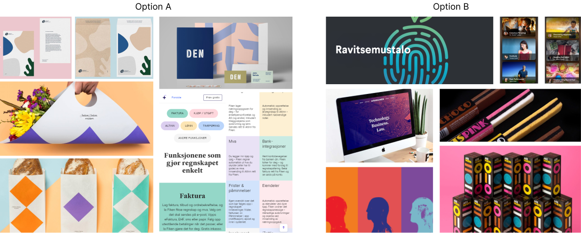
Mood Board
It became more clear to me how I wanted the visual look like until I eliminated every mood board option but the following 2 options.
I knew I wanted the visual aspect perceived as a positive, intellectual source yet with a hint of playfulness. After many considerations, I decided that for color theme will be better with option A but image replacement with option B.
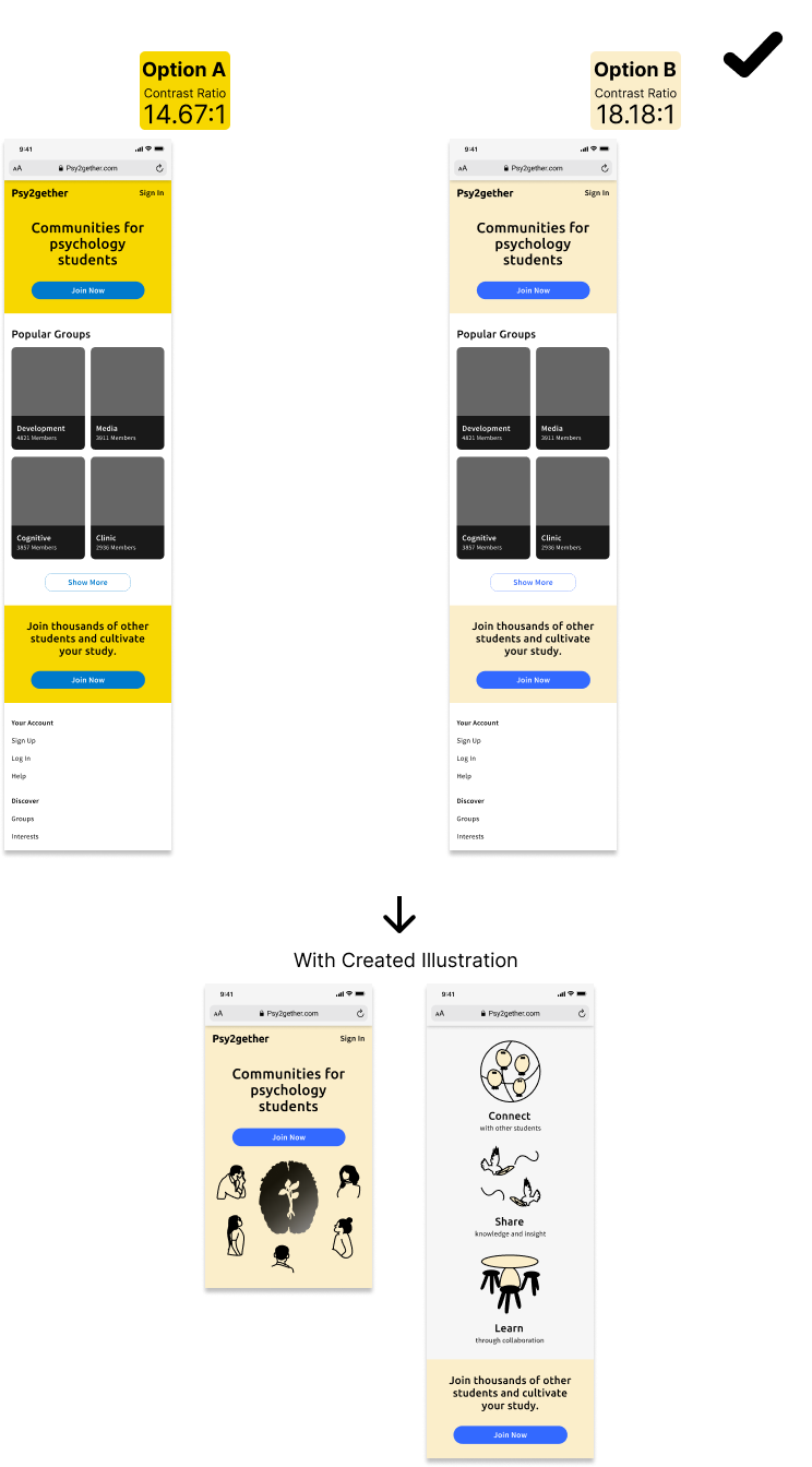
Visual Design
After exploring a diverse of color palettes from the direction above, I then wrestled with the final 2 options, both of which passed WCAG 2 contrast color accessibility. I decided to move on with option B as it is more aligned with the brand perceived value, as well as it reaches the higher contrast value.
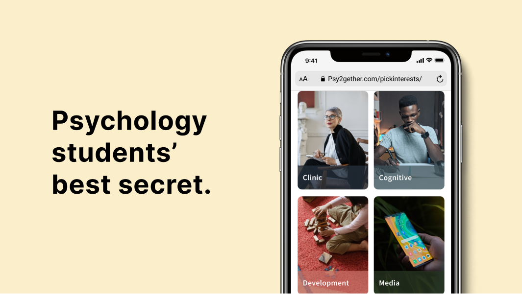
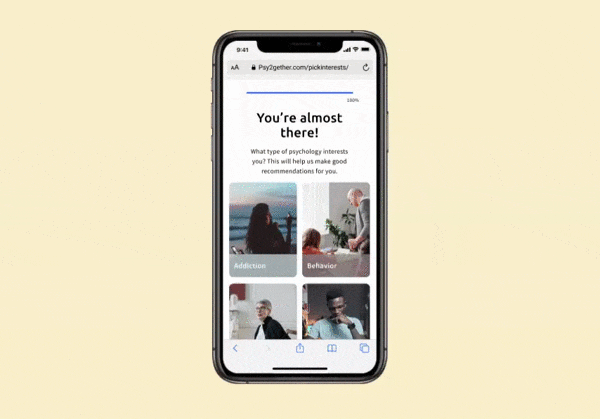
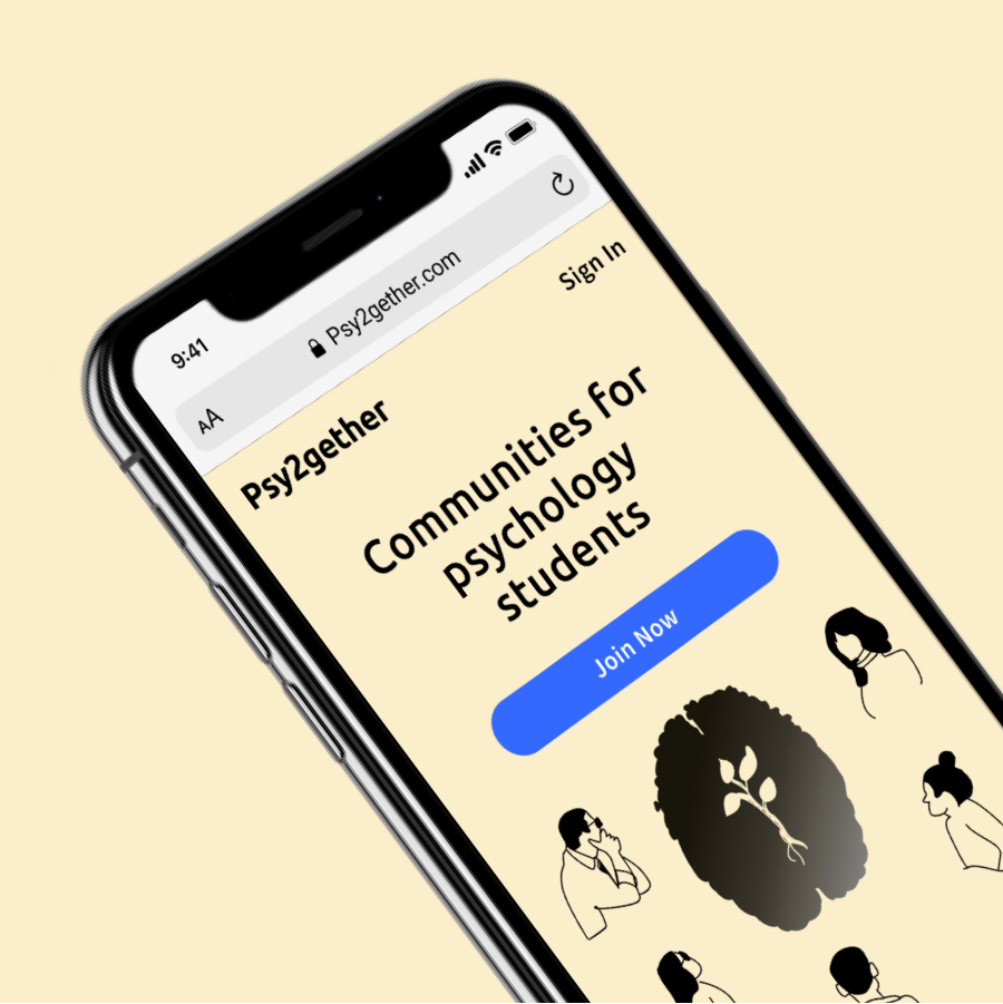
Also, I felt that illustration would be a great asset as it brings the lightness to balance out the serious nature of psychology. Hence I created different illustrations for this project.
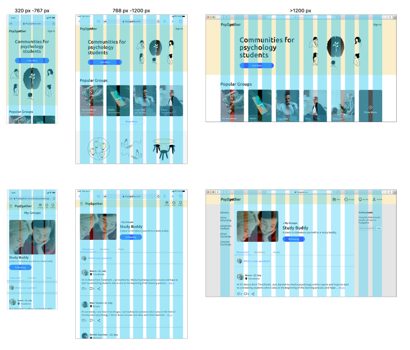
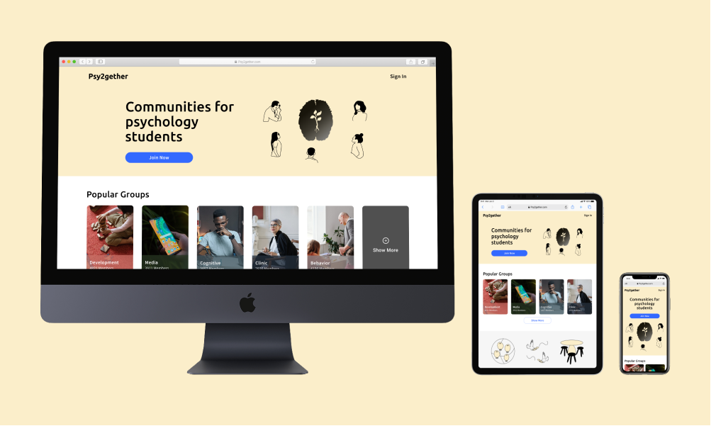
Responsive Design
As mentioned in the ideate phase, the requested deliverable of the project is based on responsive web design approach. Therefore I moved my focus on bigger screens and considered different breakpoints for different user’s contextual needs.
Evaluate
Usability testing
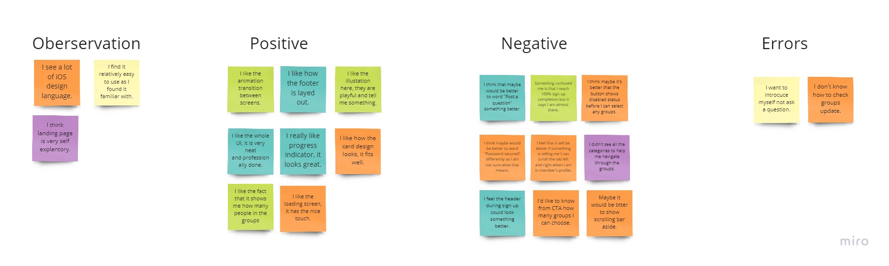
It's time to put my prototype into the hands of people who have used networking apps and get their thoughts. Therefore I conducted 5 moderated remote tests. Each was asked to perform 4 scenario tasks. The goal was to learn the learnability for people interacting with UI.
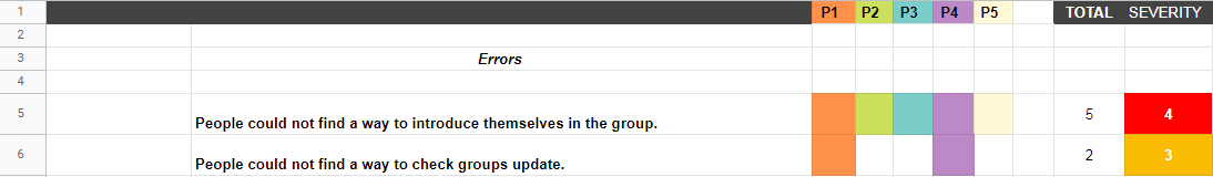
The errors from the testing are:
• No one could find a way to introduce themselves in a group.
• 2 out of 5 people could not find a way to check groups update.

Usability Testing
Rainbow speadsheet
UI Iteration
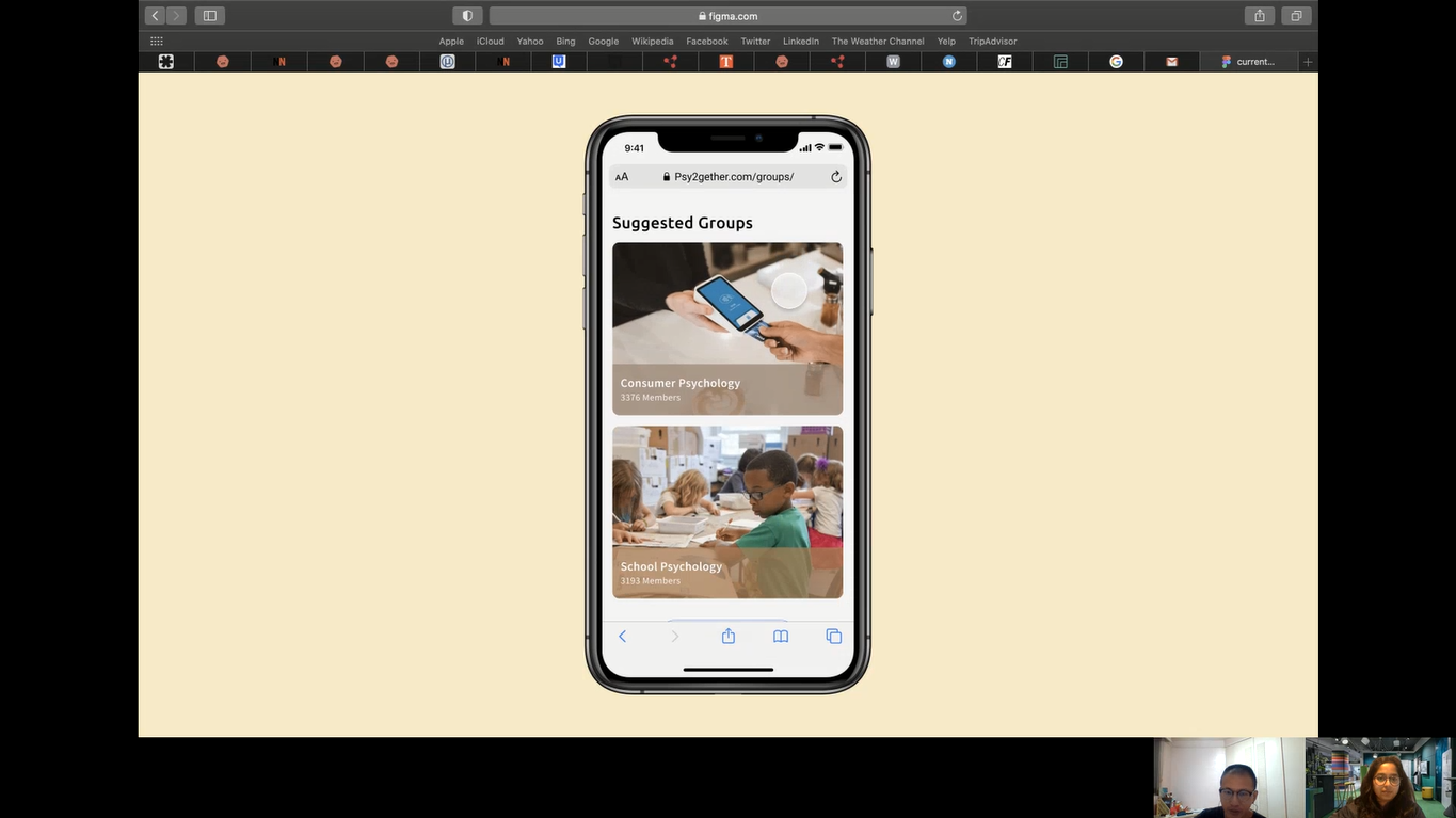
#1 Check out groups update
In 1 scenario task, people were asked to find the group's update. 2 out of 5 people clicked 'Groups" destination to find the update because they associate "Groups" with saved groups. Assuming it was the wording issue, I decided to replace "Groups" with "Home."
To validate this iterative solution, I also need to conduct more usability testing and see people's reactions.
Before

After

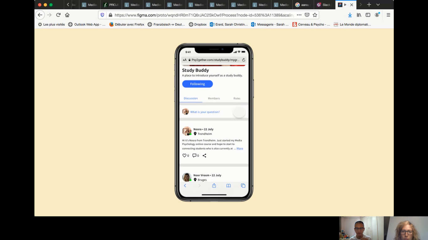
#2 Write posts
The initial wording "What is your question?" within the group was meant to tell people that they can write posts in any type of context. However, based on feedback, people consider to use it only when they have questions. If they want to introduce themselves to a group, they won't consider that as an option. Therefore I changed the wording from "What is your question?" to "Say something."
Before

After

Style guide