Yogago
Problem
Despite the plenty of yoga studios available in the metropolitan areas, urban workers still face trouble fitting yoga into their day because these yoga studios do not manage classes schedule for individual availability.
Role
Solo UX/UI designer
Timeline
Feb - July 2020 (18 weeks)
Responsibilities
User Interview & Surveying
Affinity Mapping
Design Personas
Mental Models
Journey Maps
Task Analysis
Information Architecture
Card Sorting
Native Platform Design
Wireframing
Prototyping
Usability Testing
A/B Testing
User Interface Design
Pricing Table Design

The Project
The project was to build a native app for urban workers that would include the search for yoga studios and classes for availability, listing profiles access and online reservations. Also, it would offer an opportunity to write a review after each completion.
Goals
The goal of this project was to establish a source for up-to-date yoga class information to meet the needs of urban workers. Ultimately, if more urban workers are engaged in the app, more yoga studios can see the benefit and will be more likely to participate in the platform.
Process
Start with big pictures, consider specific interactions later. Design Thinking Process has been the cornerstone of the project since day 1. It has never been linear but rather an ongoing iterative process in a constant feedback loop.
Discover
Who are the current competitors?
The first step was to identify who has been in this space with success records. The most relevant competitors I had found are:
• ClassPass (dominate USA market)
• Urban Sports Club (dominate European market)
I analyzed their UX elements, marketing strategies and SWOT to further explore what has been done and what can be improved. Here are the keys findings:
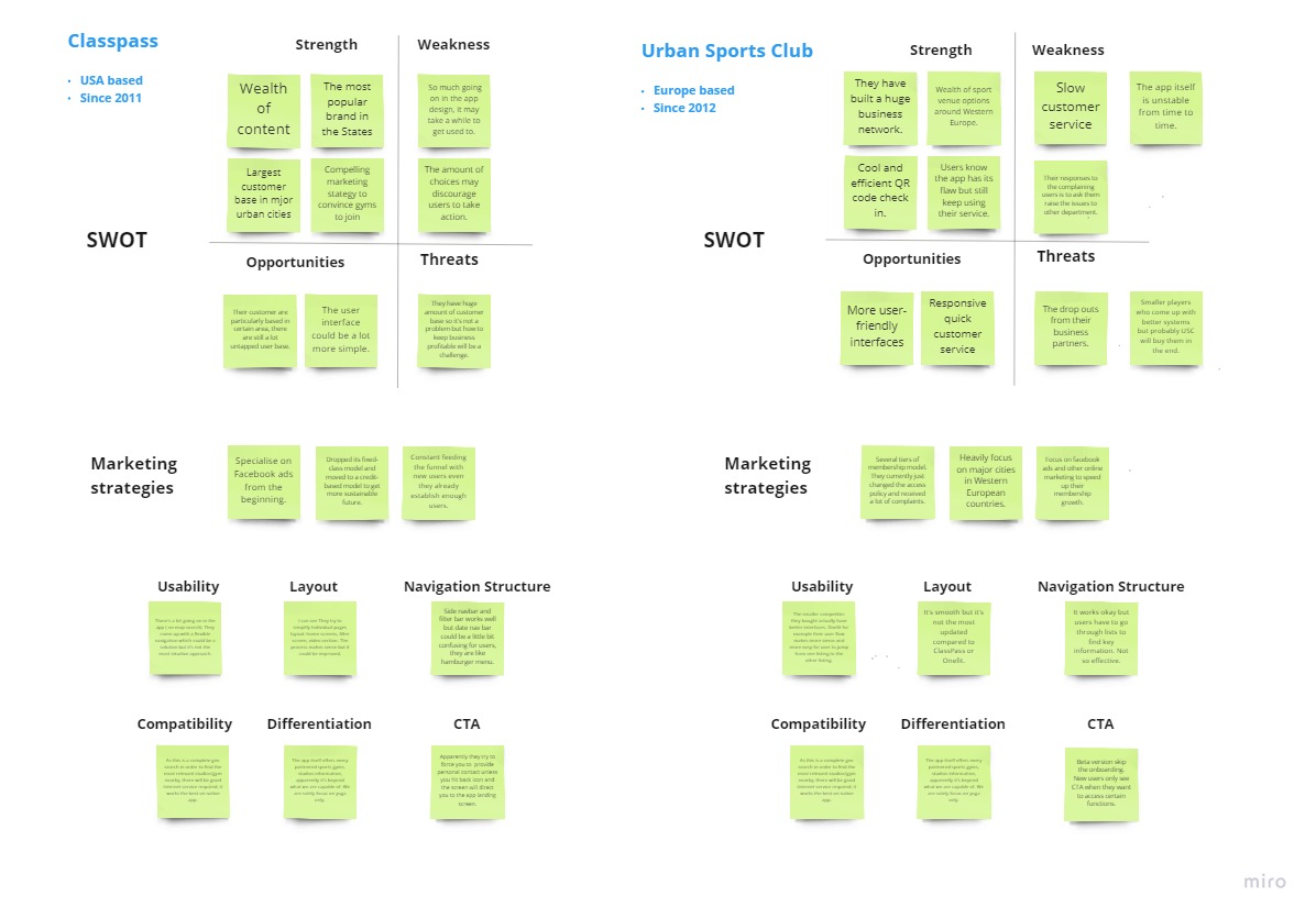
Click to view: Affinity map


Quick view about business facts
What are the user’s pain points?
To ensure customer-centric stays at the core of the project moving forward, I conducted 2 interviews with active yogis and 1 interview with an experienced yoga teacher. These interviews helped me determine the scope of the project and to better understand the yoga business's competitive landscape, yogis needs and business-critical elements.
With the results of my interview research analysis, I synthesized the data collected through the creation of the affinity map.
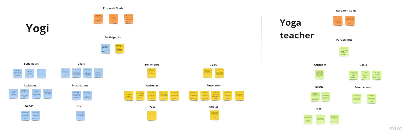
Click to view: Research Analysis

Define
Who are my design personas?
Based on the generative user research I gathered above, I started identifying what are the essential needs and motivations for my user base to create my design persona. To make my design persona an effective tool, I played around with 3 design personas and decided to keep only 1 that could capture my entire user base.
As the goal of this project was to establish a source for up-to-date yoga class information in a native app, it's also critical to acknowledge yoga teacher's needs and motivations. Hence I created a design persona for yoga teachers.
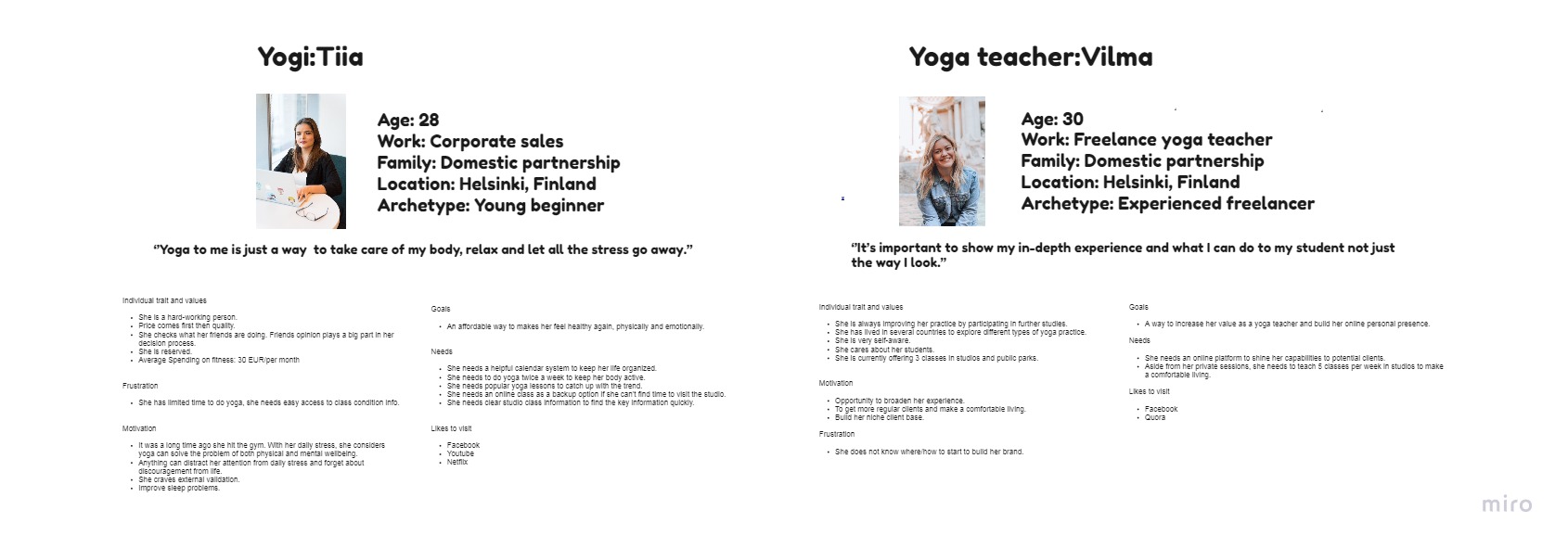
Click to view: Design User Persona
How does Tiia’s core journey look like?
To visualize Tiia internal journey and her interactions within and outside of the app, I started creating the core journey map. The key of the process was being empathetic and asking questions such as ‘’What makes her hesitate to make the next move?’’, ‘’How would she find about yoga teacher?’’, ‘’What does she think about the 14-day free trial?’’
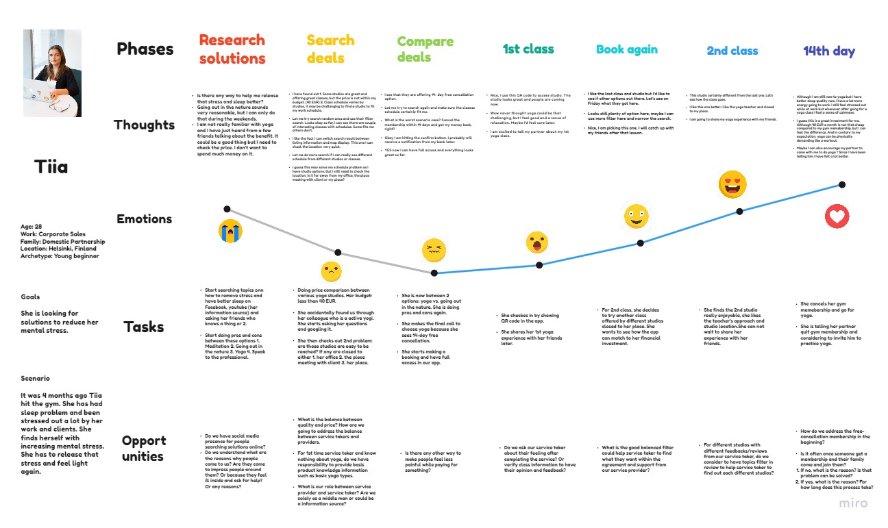
Click to view: User Journey Map

Develop
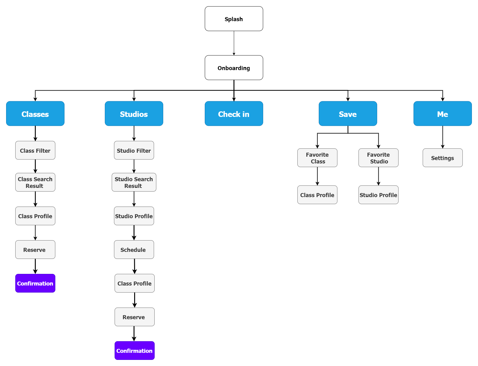
Information Architecture
To build the initial Information Architecture, I took into consideration all of the research I have gathered from define phase - user persona, user journey, user flow and competitor’s product content audit. I then conducted closed card sorting user tests to validate the initial architecture.
Rough Paper Sketches
I started by focusing on the 3 primary features (class, studios and check-in) and using pen and paper to sketch the first wireframes. During the process, the main considerations include:
• Destinations in the bottom navigation
• Destinations in the top navigation
• Categories placement in the search filter
• Top-level content placement in listing cards
• Class profile content placement
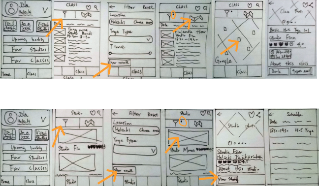
Mid-Fidelity Wireframes
After getting initial feedback for paper sketching from my mentor, the top filter navigation bar was not solving the problem for Tiia (who is actively searching yoga studios or classes within the restricted geographical area). I searched for other products and saw what other patterns can be adapted and facilitate Tiia to switch between each filter while browsing the listing content.
Another issue was the destination order in the bottom navigation. Initially, I put the user profile destination on the Home page. Then I realized that it's not the optimal option because it's only useful when Tiia has made herself reservations or she wants to check her reservation history.
I decided to move Class destination on the Home page so that whenever Tiia login into her account, she will always be able to immediately search class available and make herself reservation(s).
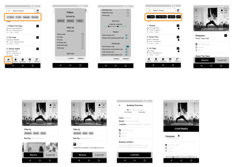
High-Fidelity Prototype
I then took mid-fidelity converted into a high-fidelity interactive prototype.
Usability Testing
As the app design progressed, it’s time to validate the app design with usability testing. The goal of usability testing was to access the learnability for new users interacting with the app for the first time. All participants were asked to perform 2 scenario tasks. 4 out of 6 participants using a competitor’s product, therefore I was able to receive valuable feedback.
With the data collected, I started using affinity mapping to help me sort test findings into 4 top-level categories: Observation, Positive Quotes, Negative Quotes and Errors. To make the organization more sense and useful, I then transferred these data to a rainbow spreadsheet.
Usability Testing
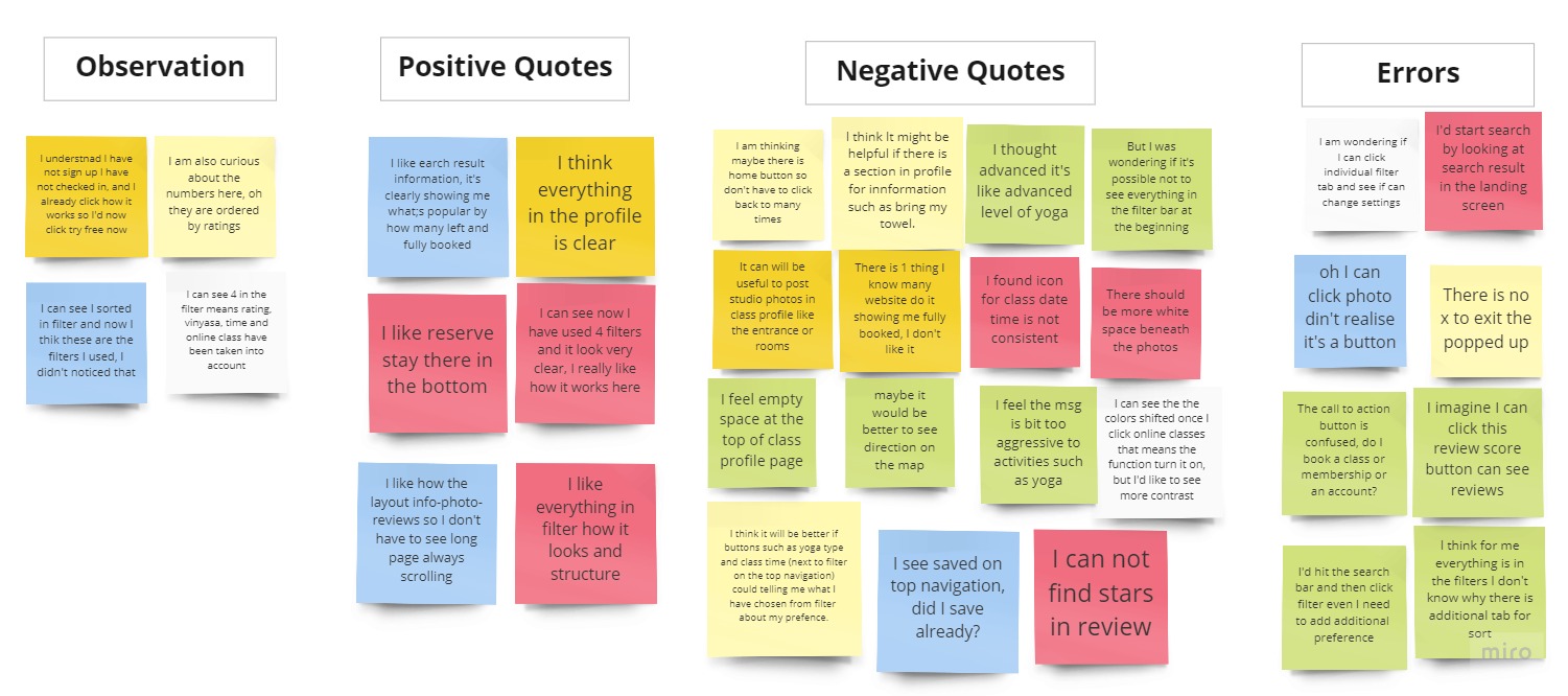
Search for yoga classes
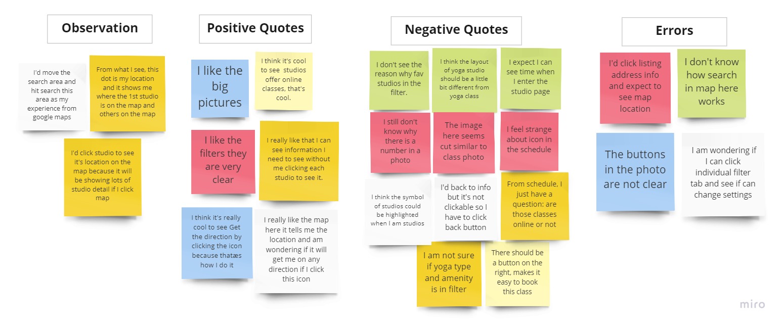
Search for yoga studios
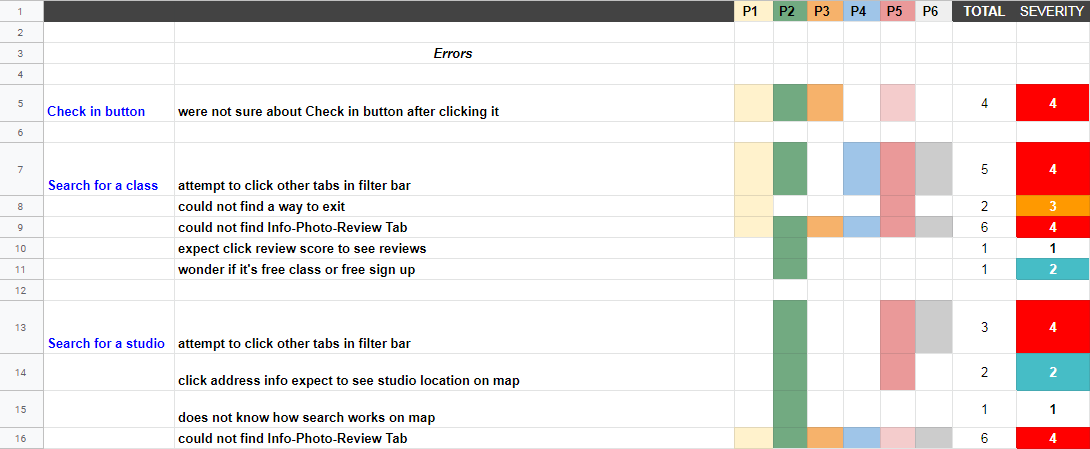
Rainbow Spreadsheet
UX Iteration
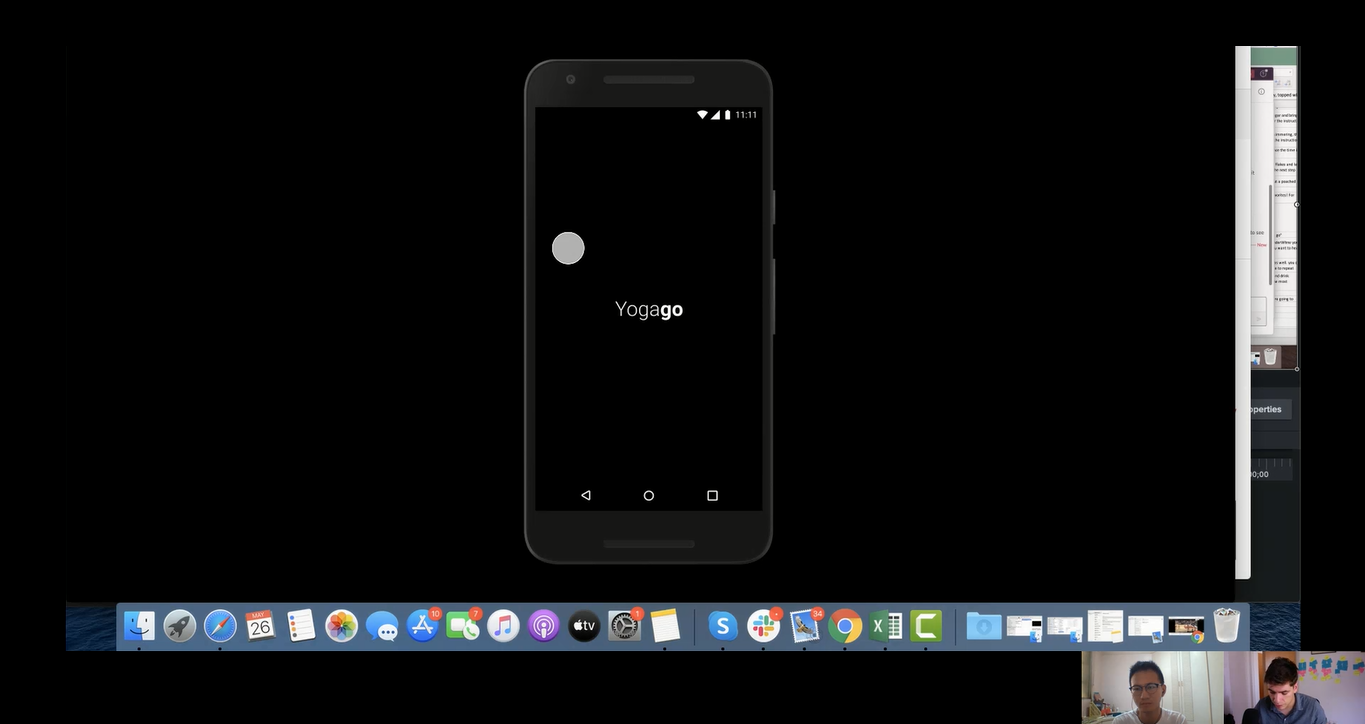
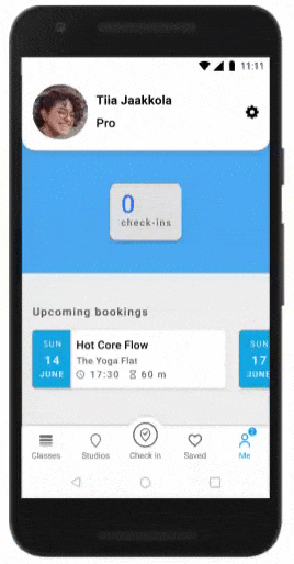
#1 "Check in" experience
People wanted to know how "Check in" works after they click the 14-day free trial, however, it was not part of the initial prototype experience.
Before
It made people wondered whether "Check in" works like Facebook check-in or check-in upon arrival.
After
I included the post-sign-up "Check in" experience. People now can see how it works once they have signed up.
#2 Activate filter chips
People wanted to understand how different chips interact.
Before
People could only click the "Filters" chip.
After
I added flashing out UI interactive experience.
#3 High contrast tab background
No one could notice a tab sit within the header image.
Before
Low color contrast between the header image and the tab.
After
I added gradient-color background to increase contrast.
Deliver
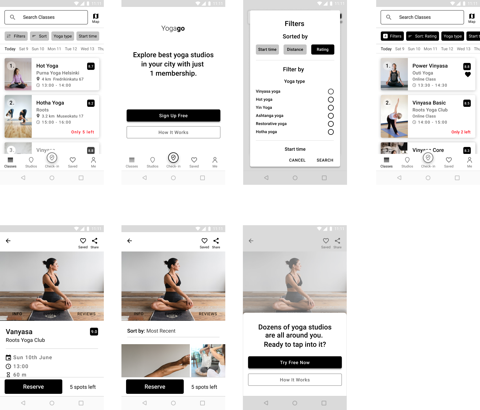
Visual Design
My focus for the visual was to enhance the functionality and helping Tiia to find the information quickly. Even though I kept it focused, I had a lot of doubt about my decision on colour choices if were too basic or boring to Tiia. I kept reminding myself to focus on the process of iteration that could help me gather feedback faster.
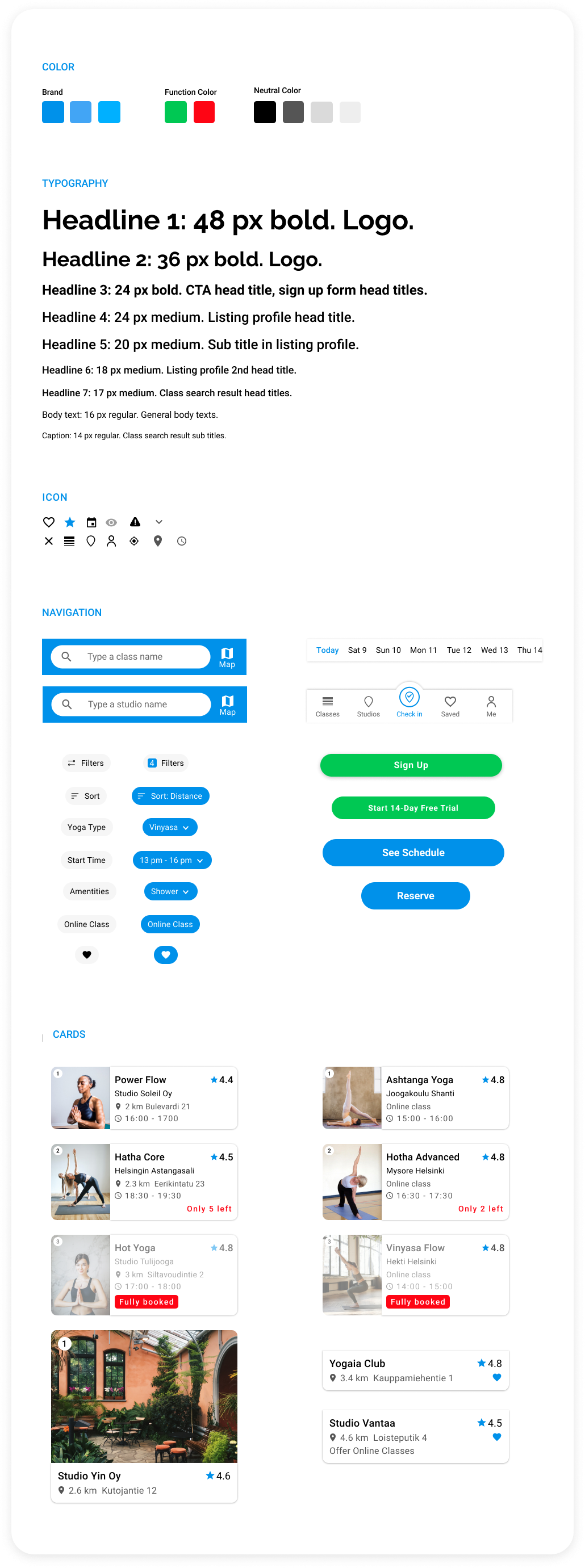
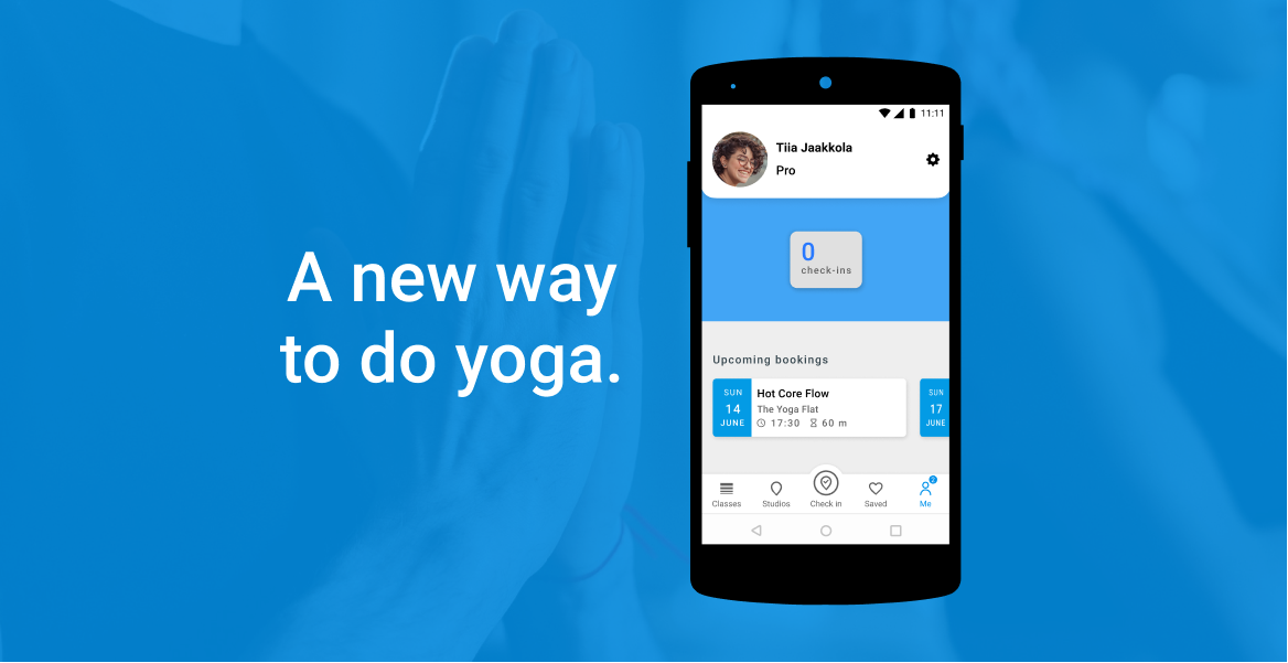
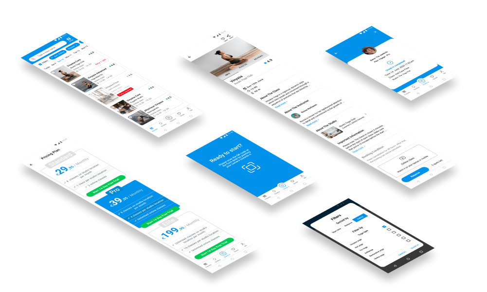
Final Design
My final design encompassed the following tasks Tiia can accomplish:
• Search classes from Class/Studio destination.
• Search studios from Studio destination.
• Pick a plan and start her 14-day free trial.
• Complete her reservation and receive the ticket.
• Check in by scanning the QR code at the front desk.
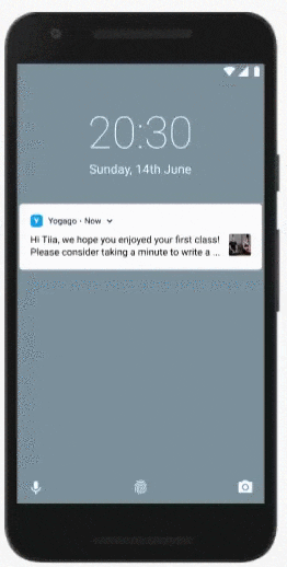
• Write a review after complete her class.
Sign up & start 14-day free trial
Before checking-in and taking yoga classes, sign-up is required.
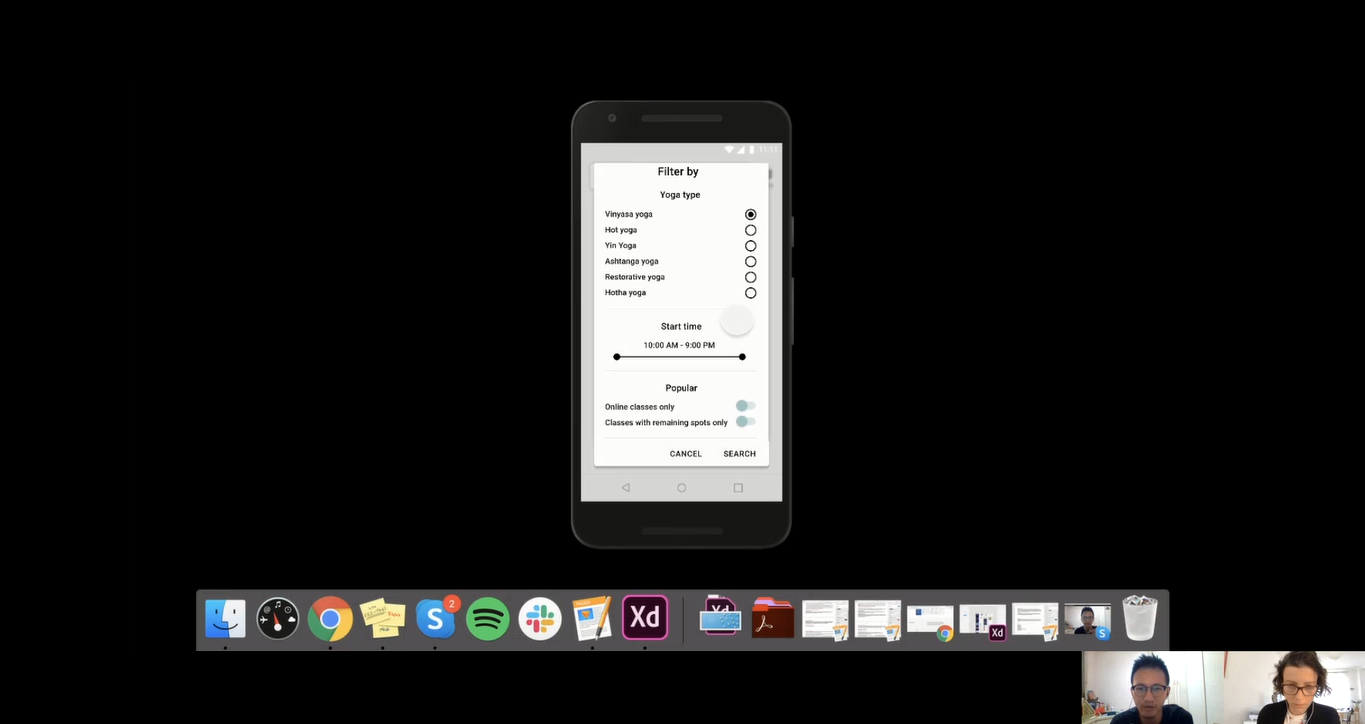
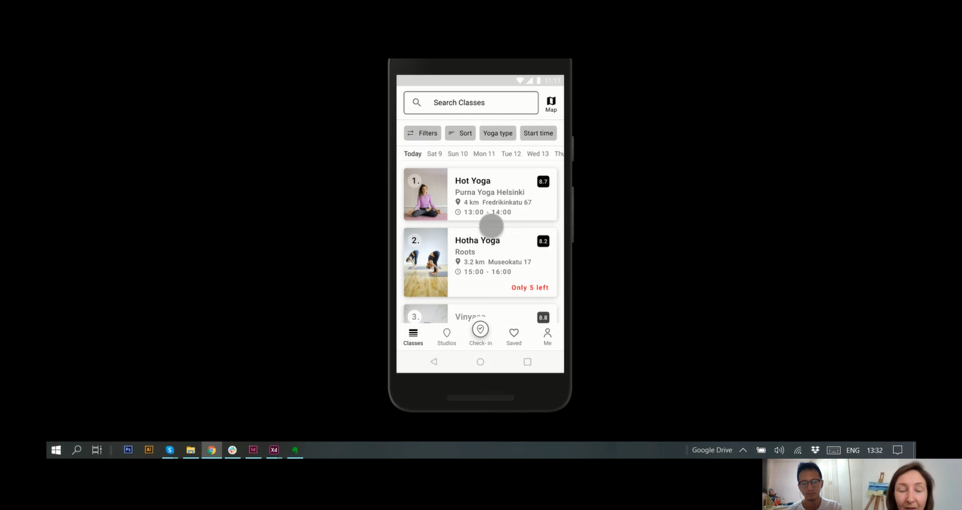
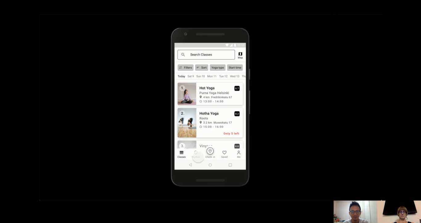
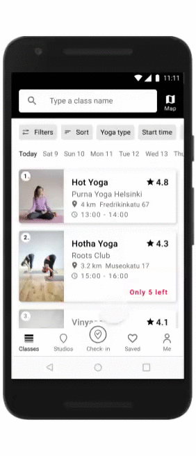
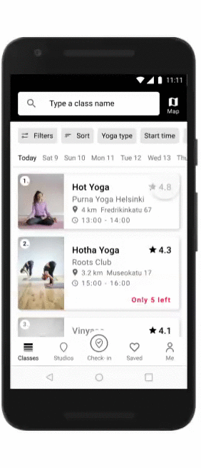
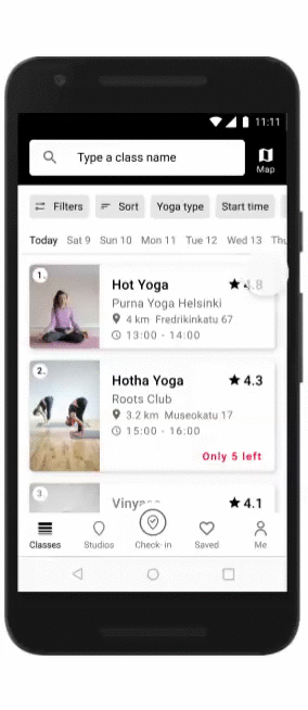
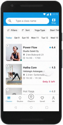
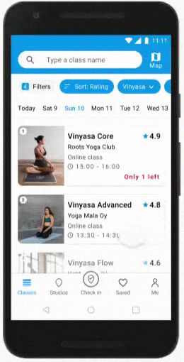
Filter classes & access the detail
Filter classes through chips
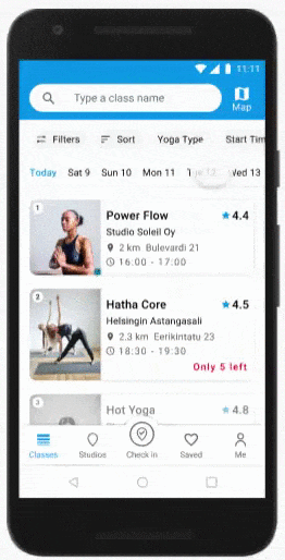
Pick a date
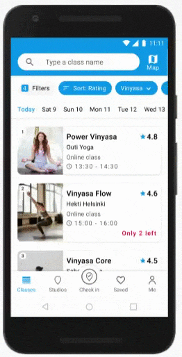
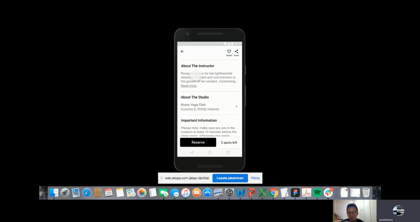
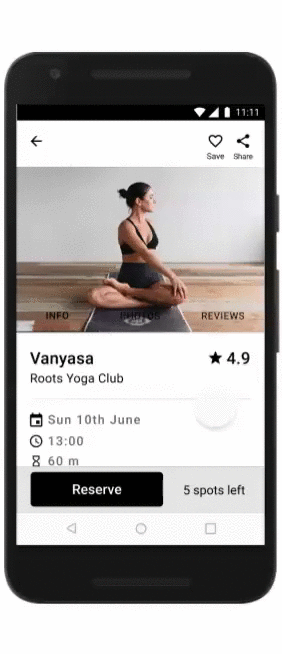
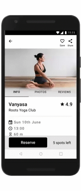
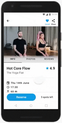
Access the class detail
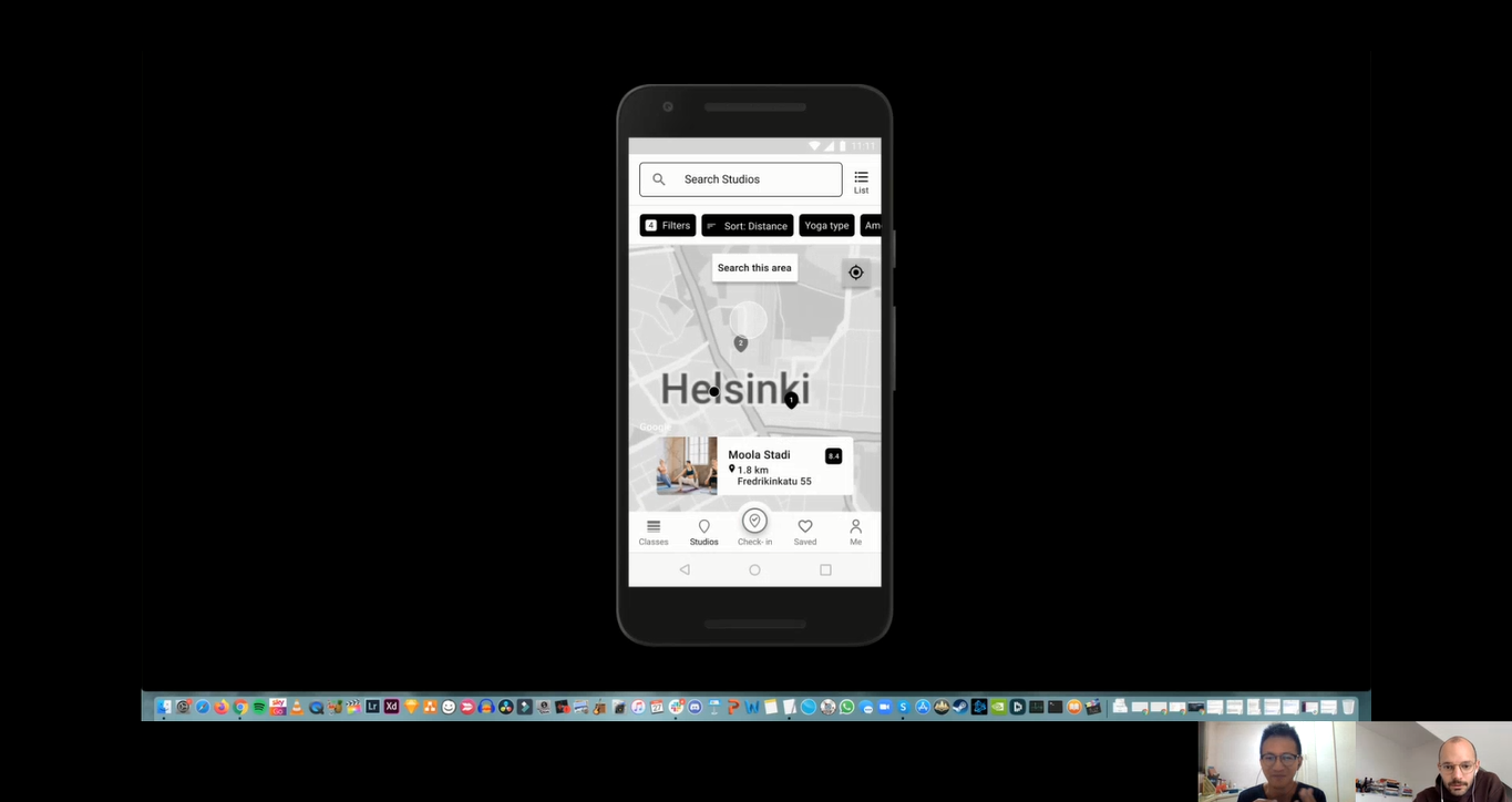
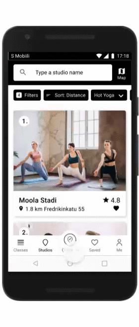
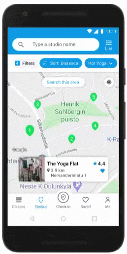
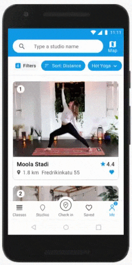
Filter studios & access the detail
Filter studios through chips
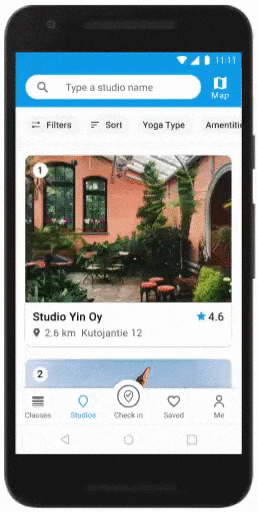
Search studio area on Google Maps
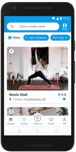
Access the studio detail
Complete reservation
Confirm reservation
Receive the reservation ticket
Check-in upon arrival
Check-in by scanning the QR code at the front desk
Write a review
Receive a notification for a review request